HomeBlogPTE Describe Image: Complete Guide, Templates & 6 Image Types
PTE Academic

PTE Describe Image: Complete Guide, Templates & 6 Image Types

B

Hasan

Editor

PUBLISHED ON: JULY 21, 2026


PTE Describe Image: The Complete Guide to Every Image Type and How to Score Maximum Points

Describe Image is the PTE Speaking task candidates fear most, and for good reason: you get 25 seconds to understand a chart, graph, table, diagram, or picture you've never seen before, and 40 seconds to describe it fluently, with no script and no second chance. Unlike Repeat Sentence, where the content is handed to you, Describe Image demands that you generate your own content, structure, and language simultaneously, under real time pressure, about a visual you might not fully understand at first glance.

Most preparation resources treat this task with a single generic template and a handful of example images, which leaves candidates unprepared the moment they encounter an image type or subject they didn't specifically rehearse. This guide takes a different approach: a dedicated, worked-through structural method for every image type you'll actually encounter — seven in total, including maps, which many guides overlook — so that what you're building is genuine, transferable flexibility, not a script tied to a handful of practice images. It covers the exact scoring rubric behind this task, worked sample descriptions for each image type, the universal three-part template that adapts across every type, a full vocabulary bank organized by function, and a structured plan to build genuine fluency with this task rather than memorizing a script that collapses the moment you see something unfamiliar.

What Is PTE Describe Image, Exactly?

Describe Image is a task within the Speaking & Writing section of PTE Academic and PTE Core. You're shown a single image — a bar graph, line graph, pie chart, table, process diagram, map, or photograph — and given 25 seconds to study it and plan your response. Once that preparation window ends, your microphone opens automatically and you have 40 seconds to describe the image aloud, covering its key features, trends, and, where relevant, the relationships between different elements shown.

There's no fixed script that works for every image, which is exactly why this task trips up candidates who over-rely on rigid templates prepared for one specific image type and then encounter a different one on test day. What actually determines your score is whether you can flexibly apply a consistent structural approach — not a memorized script — to whatever image appears in front of you, describing it accurately, fluently, and with natural pronunciation within the 40-second window.

The Complete Format Breakdown

Preparation time: 25 seconds to study the image before you're expected to speak. This is meaningfully longer than Repeat Sentence's zero preparation time, but short enough that you cannot afford to spend it staring blankly or trying to process every single data point before planning your response.

Response time: 40 seconds to describe the image aloud, once your microphone opens automatically at the end of the preparation window.

Image display: The image remains visible on screen throughout both your preparation time and your speaking time, so you can continue referring back to it as you speak — you don't need to memorize the image itself, only your planned structure and key points.

Frequency in the exam: Describe Image typically appears multiple times across the Speaking section, interspersed with Read Aloud, Repeat Sentence, Re-tell Lecture, Answer Short Question, and the newer Respond to a Situation and Summarize a Group Discussion tasks.

The Full Scoring Rubric: All 16 Points, Explained

Describe Image is scored across three criteria, each contributing to a combined maximum of 16 points, based on Pearson's own official scoring documentation.

Content — 0 to 6 points

This is the largest single scoring component for this specific task, and it measures whether your description is complete, accurate, and analytically developed. According to Pearson's own rubric, the top score requires that your "response describes the image fully and accurately and expands on the relationships between features of the image to provide a nuanced interpretation" — meaning the highest-scoring responses don't just list what's visible, they connect and interpret it. The lowest scores are reserved for responses that are "relevant to the prompt but too limited to assign a higher score" — meaning even a response that's on-topic but shallow, incomplete, or purely descriptive without any deeper connection between elements, is capped well below full marks.

Oral Fluency — 0 to 5 points

This measures whether your speech flows smoothly and naturally across the full 40 seconds. Top marks require speech that "shows smooth rhythm and phrasing" with "no hesitations, repetitions, false starts or phonological simplifications." The lowest score describes "slow, labored speech with minimal phrase grouping and multiple pauses" — meaning halting, start-stop delivery caps this score regardless of how accurate your content is.

Pronunciation — 0 to 5 points

This measures whether a fluent English speaker would find your speech clearly intelligible, with vowels and consonants easily understood and correct word stress. The lowest score is reserved for pronunciation "characteristic of another language" where "over half" of your speech is unintelligible.

Where the Points Actually Live: A Different Balance Than Repeat Sentence

If you've already worked through our Repeat Sentence guide, you'll notice this task's point distribution tells a meaningfully different story. In Repeat Sentence, Content is worth only 3 of 13 points, making fluent delivery of an imperfect recall the clearly dominant strategy. In Describe Image, Content is worth 6 of 16 points — more than a third of the total, and larger than either Fluency or Pronunciation individually.

This changes your strategic priority meaningfully. While fluent, confident delivery still matters enormously here (Fluency and Pronunciation combined still total 10 of 16 points, the majority), you cannot treat Content as an afterthought the way partial-recall thinking might tempt you to on Repeat Sentence. A response that's fluently delivered but genuinely thin on content — describing only one or two surface-level features of a rich, multi-element chart — is capped meaningfully below a response that's slightly less polished but genuinely comprehensive and analytically connected. The real skill this task demands is generating substantive, connected content fluently at the same time — not choosing between the two.

The Universal Three-Part Template

Regardless of which image type you encounter, a consistent structural shape adapts across all of them, and internalizing this shape — not a memorized script — is what actually transfers across unfamiliar images on test day.

Opening (5-7 seconds, roughly 10-15 words): State what the image is and its general subject. This should be a genuine paraphrase suited to the specific image, not a single frozen sentence reused verbatim across every response — reusing identical opening phrasing across many responses is exactly the kind of generic, templated pattern current content-relevance scoring is designed to notice.

Body (25-28 seconds, the bulk of your response): Describe the key features, trends, or stages shown, prioritizing the most significant or striking elements rather than attempting to mention every single data point, especially on data-dense images like detailed tables. Where the image supports it, explicitly connect or compare elements — this is exactly what the top-scoring Content band rewards ("expands on the relationships between features").

Closing (5-8 seconds): A brief concluding statement — an overall summary, the most significant takeaway, or, where appropriate, a brief inference about what the pattern might suggest. This doesn't need to be profound; even a simple "overall, the data shows a clear upward trend across the period" closes the response cleanly rather than trailing off mid-thought when your 40 seconds run out.

Using Your 25 Seconds of Preparation Time Effectively

How you spend this short window matters enormously, since it's genuinely easy to waste it either freezing or over-analyzing.

Seconds 1-5 — Identify the image type and overall subject. Is this a bar graph, line graph, pie chart, table, process diagram, or picture? What's the general topic (sales figures, population data, a manufacturing process, a natural scene)? This single identification step should happen almost instantly and sets up which structural approach from this guide you'll apply.

Seconds 6-18 — Identify 3-4 key features or trends, not every detail. Scan for the most significant, describable elements: the highest and lowest points, the overall direction of change, the largest and smallest categories, the first and last stages of a process. Resist the urge to mentally catalog every single number or label — you have 40 seconds to speak, not two minutes, and attempting exhaustive coverage of a data-dense image is a losing strategy that produces rushed, incomplete delivery.

Seconds 19-25 — Mentally sequence your opening line and body order. Decide which feature you'll mention first, second, and third, and how you'll close. You don't need fully-formed sentences planned — just a clear mental sequence, so that when your microphone opens, you're executing a plan rather than improvising from a blank start.

Image Type 1: Bar Graphs

Bar graphs display data as rectangular bars, typically comparing discrete categories (countries, products, years, groups) against a shared numerical measure.

How to read it quickly: Identify what the bars represent (the categories on one axis) and what's being measured (the values on the other axis). Note the tallest and shortest bars first, then scan for any clear overall pattern — steadily increasing, decreasing, or no clear trend across categories.

Structural approach: State the chart's subject and what's being compared, identify the highest and lowest values by name, note any other significant comparisons or groupings, and close with an overall pattern or notable takeaway.

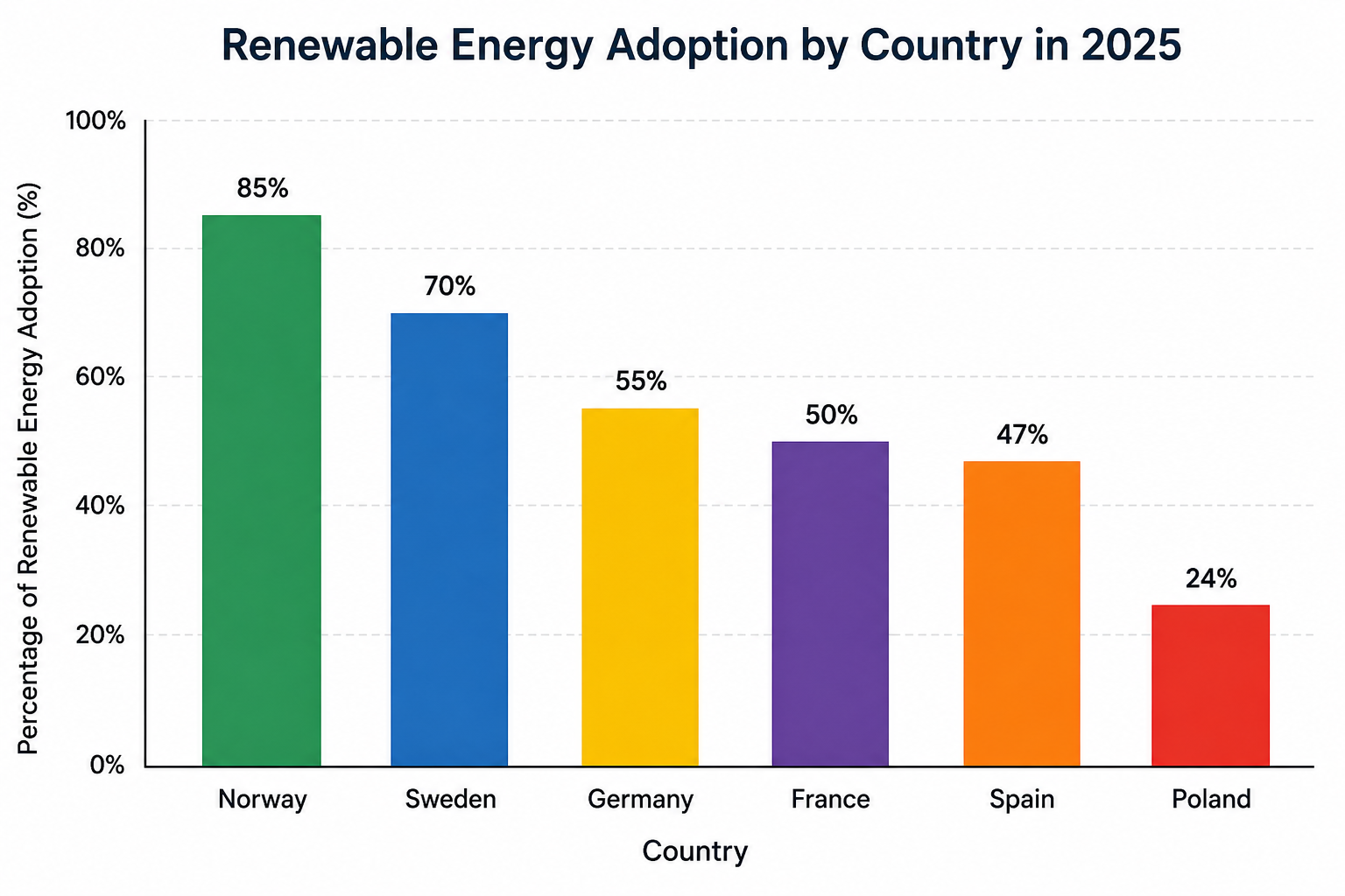
Worked sample description (bar graph showing renewable energy adoption by country):

"This bar graph illustrates the percentage of renewable energy adoption across six countries in 2025. Norway leads significantly with approximately 85 percent renewable energy usage, followed by Sweden at around 70 percent. In contrast, Poland shows the lowest adoption rate at just under 25 percent. The remaining three countries — Germany, France, and Spain — cluster in the middle range, between 45 and 55 percent. Overall, the data reveals a considerable gap between Northern European countries and the rest of the group, suggesting regional policy or resource differences likely play a significant role in this disparity."

Common mistakes specific to bar graphs: Reading out every single bar's exact value sequentially, which produces a monotonous list rather than an analytically connected description; failing to explicitly name which categories are highest and lowest, even when that's visually obvious; ignoring genuine groupings or clusters among the middle-range bars that would strengthen your Content score if mentioned.

Image Type 2: Line Graphs

Line graphs plot data points connected by lines, almost always representing change over time — the task here is fundamentally about describing trajectory and trend, not static comparison.

How to read it quickly: Identify what's being tracked and over what time period. Note the starting point, the ending point, and any significant peaks, dips, or turning points along the way — a line that rises steadily tells a very different story than one that rises, falls sharply, then recovers.

Structural approach: State the subject and time period, describe the overall trajectory (steady increase, decrease, fluctuation), highlight specific notable points (a peak, a sharp drop, a plateau), and close with the net overall change from start to end.

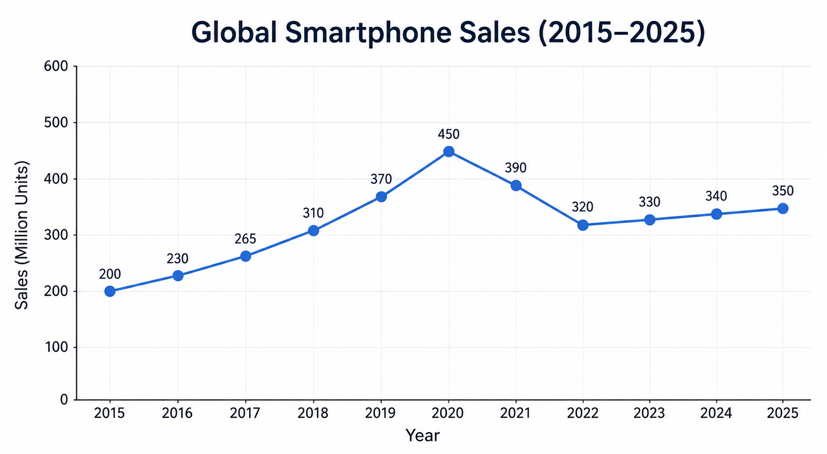
Worked sample description (line graph showing smartphone sales over a decade):

"This line graph tracks global smartphone sales from 2015 to 2025. The graph shows a steady upward trend for the first five years, rising from around 200 million units to a peak of nearly 450 million units in 2020. However, sales then declined sharply over the following two years, dropping to approximately 320 million by 2022, likely reflecting market saturation. From 2022 onward, the trend stabilizes, showing only modest fluctuation through to 2025. Overall, despite the mid-period decline, the graph indicates substantially higher sales at the end of the period than at the beginning."

Common mistakes specific to line graphs: Describing the line's shape purely visually ("it goes up, then down, then up again") without naming the actual time periods or approximate values where the pattern shifts; missing the single most important feature of most line graphs — the overall net change from the first point to the last; treating every minor wiggle in the line as equally significant rather than prioritizing the clearest, most describable pattern.

Image Type 3: Pie Charts

Pie charts show how categories divide up a whole, typically as percentages of a single total — the core skill here is proportional comparison, not sequential description.

How to read it quickly: Identify what the whole pie represents, then note the largest slice, the smallest slice, and any slices that are roughly equal to each other, which often make for a natural comparison point.

Structural approach: State what the pie chart represents as a whole, identify the largest segment, identify the smallest segment, note any other significant proportions or near-equal groupings, and close with an overall observation about how evenly or unevenly the whole is divided.

Worked sample description (pie chart showing household energy consumption by category):

"This pie chart displays the breakdown of household energy consumption by category. Heating and cooling account for the largest share by far, representing 42 percent of total consumption. Water heating is the second largest category at 18 percent, followed closely by lighting and electronics, which together make up around 25 percent combined. Appliances and miscellaneous use account for the remaining 15 percent. Overall, the chart shows that climate control alone consumes nearly half of all household energy, considerably more than any other single category, highlighting where the greatest efficiency gains could likely be made."

Common mistakes specific to pie charts: Listing every slice's percentage in the exact order they appear on screen rather than prioritizing the largest and smallest first; failing to make any proportional comparison between slices (saying what each is, without ever comparing them to each other); treating a pie chart as if it shows change over time, when it typically represents a single snapshot instead.

Image Type 4: Tables

Tables present data in rows and columns, often containing more raw information than any other image type — which makes them uniquely risky, since attempting to describe every cell guarantees running out of time and producing a shallow, list-like response.

How to read it quickly: Identify what the rows and columns represent, then scan specifically for the highest value, the lowest value, and any clear pattern across a row or column — tables reward identifying trends within the data, not reciting the data itself.

Structural approach: State what the table shows overall, identify the standout highest and lowest values, note any clear pattern across a row or column (steady increase down a column, for instance), and close with a summary observation — explicitly avoid attempting to read out most or all of the individual cells.

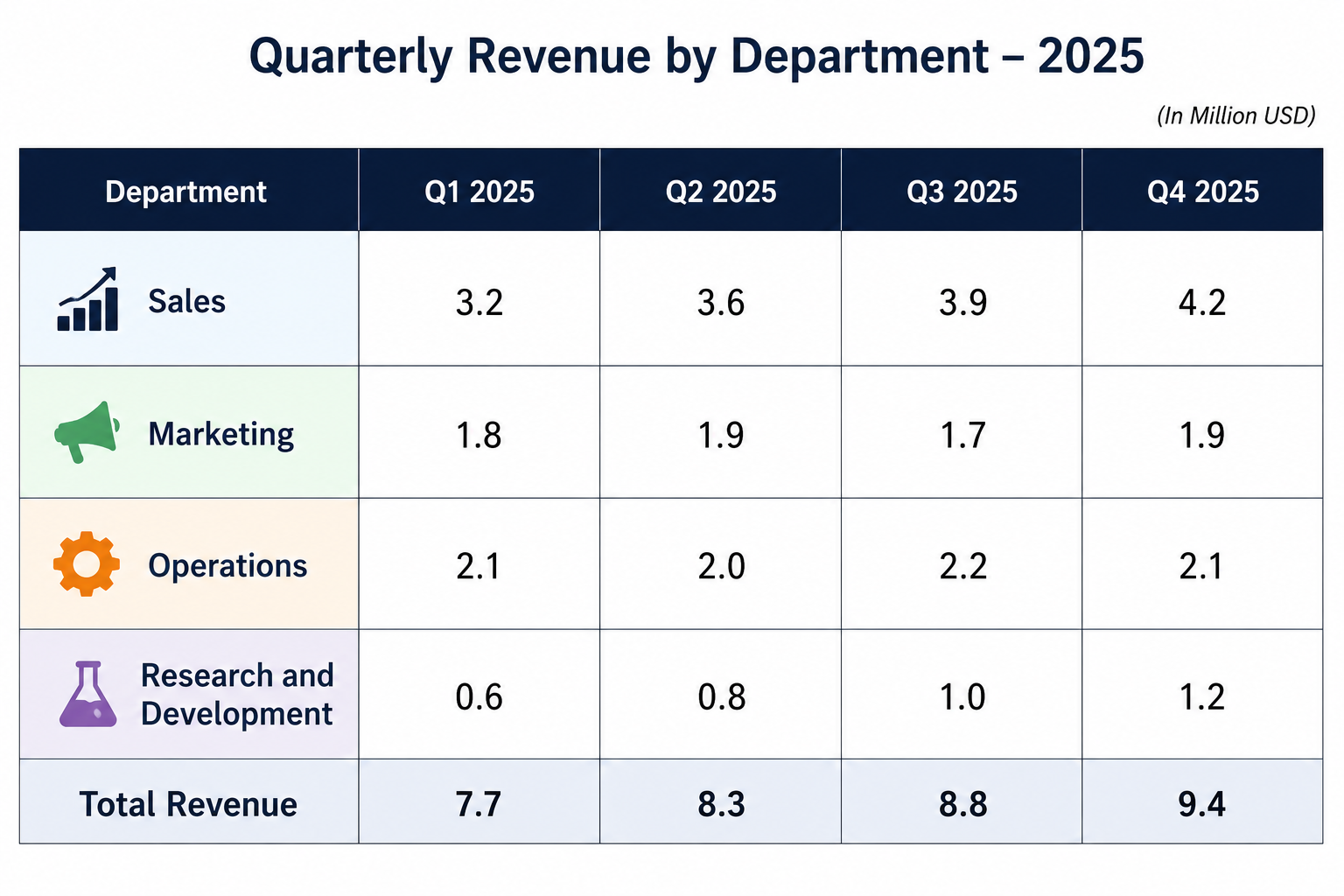
Worked sample description (table showing quarterly revenue by department):

"This table presents quarterly revenue figures for four company departments across 2025. The Sales department consistently generated the highest revenue in every quarter, peaking at 4.2 million dollars in the fourth quarter. In contrast, the Research and Development department showed the lowest figures throughout the year, though its revenue nearly doubled from the first to the fourth quarter, suggesting a growing investment return. Marketing and Operations remained relatively stable across all four quarters, with only minor fluctuation. Overall, the table indicates that while Sales dominates total revenue, Research and Development is the department showing the most significant growth trajectory."

Common mistakes specific to tables: Attempting to mention every row and column value, which is the single most common failure mode on this image type and directly causes rushed, incomplete responses; failing to identify column-wise or row-wise trends (a value that increases steadily down a column is a genuine pattern worth naming, not just a set of disconnected numbers); ignoring the table's title or headers, which often contain the context needed to correctly interpret what the numbers actually represent.

Image Type 5: Process and Flow Charts

Process diagrams depict a sequence of stages — a manufacturing process, a natural cycle, an organizational workflow — where the core skill is chronological, logically-connected description rather than data comparison.

How to read it quickly: Identify the starting point and ending point of the process, then count the number of distinct stages in between, noting any stage that clearly branches, loops back, or represents a significant transition point.

Structural approach: State what process the diagram depicts, describe the stages in strict chronological order using clear sequencing language (first, next, following this, subsequently, finally), and close with a brief statement about the overall outcome or purpose of the process.

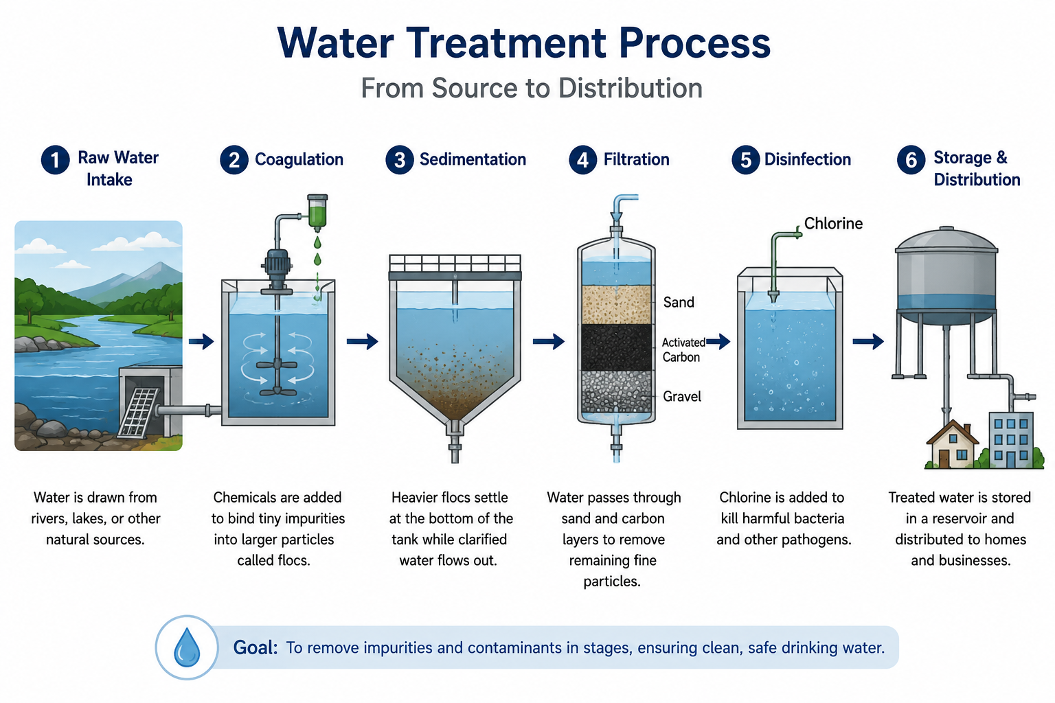
Worked sample description (flow chart showing the water treatment process):

"This diagram illustrates the water treatment process from source to distribution. The process begins with raw water intake from a natural source, which then undergoes a coagulation stage where chemicals are added to bind impurities together. Following this, the water passes through a sedimentation tank, allowing heavier particles to settle. Next, the water is filtered through sand and carbon layers to remove remaining fine particles. Subsequently, a disinfection stage using chlorine eliminates harmful bacteria. Finally, the treated water moves to a storage reservoir before distribution to households. Overall, the process involves five distinct stages designed to progressively remove impurities and ensure the water is safe for consumption."

Common mistakes specific to process diagrams: Describing stages out of order, or without clear sequencing language, which directly damages both Content and Coherence, since the entire point of this image type is chronological logic; treating each stage as an isolated fact rather than explicitly connecting consecutive stages ("following this," "as a result"); rushing through the final stage or omitting the process's overall purpose, leaving the description feeling incomplete even if every individual stage was technically mentioned.

Image Type 6: Pictures and Photographs

Pictures show a real-world scene rather than data — a street scene, a natural landscape, people engaged in an activity — and this image type is often, mistakenly, treated as easier than the data-driven types, when it actually demands a different, equally deliberate structural approach.

How to read it quickly: Identify the setting, the main subjects or activities shown, and any notable secondary details or context clues that suggest a broader story or purpose behind the scene.

Structural approach: State the general setting and subject, describe the main elements or activities in the foreground, note relevant background or contextual details, and close with an inference about the scene's likely purpose, mood, or significance — this last step is what separates a merely descriptive response from one that reaches the top Content band's "nuanced interpretation" standard.

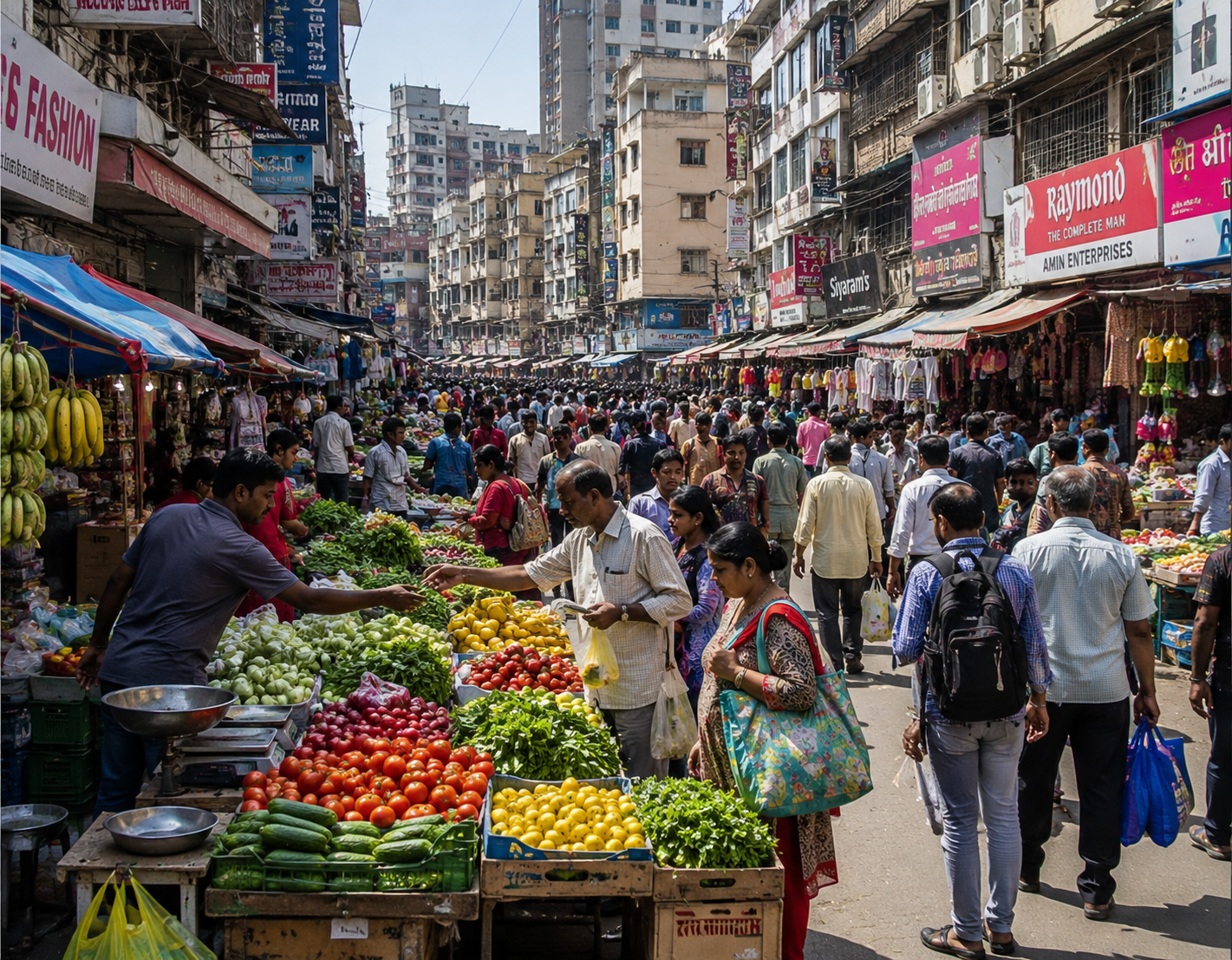
Worked sample description (photograph of a busy urban market):

"This photograph shows a bustling outdoor market in what appears to be a densely populated city center. In the foreground, several vendors are seen selling fresh produce, including fruits and vegetables displayed in wooden crates. Numerous shoppers move through narrow pathways between the stalls, suggesting the market is a popular and well-frequented location. In the background, multi-story buildings and overhead signage indicate this is likely a permanent, established marketplace rather than a temporary or seasonal setup. The overall atmosphere conveyed by the image is one of vibrant, everyday commercial activity, reflecting the central role local markets often play in urban community life."

Common mistakes specific to pictures: Providing only a flat, literal inventory of visible objects ("there is a table, there are people, there is a building") without any structural organization or interpretation; missing the opportunity for a closing inference, which is specifically where pictures allow you to reach the highest Content band through genuine interpretation rather than pure description; over-focusing on minor background details at the expense of the scene's clear main subject.

Image Type 7: Maps

Maps appear regularly in Describe Image, typically showing geographic distribution — population density, resource locations, climate zones, or change to a location over time (two maps of the same area at different dates, showing development or environmental change).

How to read it quickly: Identify what the map represents and its geographic scope, then note which regions show the highest and lowest values or most significant features, along with any clear overall geographic pattern (concentration in one area, an even spread, a clear north-south or coastal-inland divide).

Structural approach: State what the map shows and its geographic scope, identify the regions or areas with the most significant concentration or feature, note any clear overall geographic pattern or divide, and close with an observation about what that pattern might suggest.

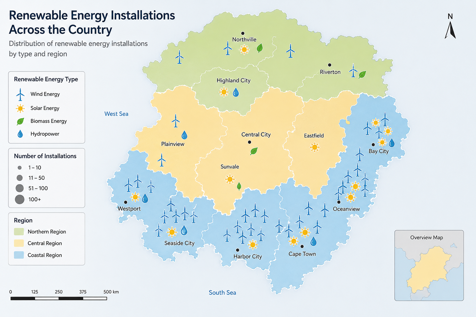
Worked sample description (map showing renewable energy installations across a country's regions):

"This map illustrates the distribution of renewable energy installations across the country's regions. The coastal areas, particularly in the south, show a notably high concentration of installations, likely reflecting greater access to wind resources along the coastline. In contrast, the central inland regions show comparatively sparse development, with only a handful of installations marked. The northern region shows moderate distribution, clustered mainly around two or three urban centers. Overall, the map reveals a clear coastal-to-inland divide in renewable energy development, suggesting that geographic access to resources like wind and, likely, government regional investment priorities have shaped where this infrastructure has concentrated."

If the map shows two time periods side by side (a common variant), explicitly structure your response around the change between them rather than describing each map in isolation — "in 2010, the region showed minimal development, whereas by 2025, the same area shows significant expansion" is a stronger response than separately describing each map without ever directly comparing them.

Common mistakes specific to maps: Describing individual markers or points one by one rather than identifying overall geographic patterns and concentrations; failing to reference actual geographic features or directions (coastal, northern, inland) that make your description spatially clear to a listener; when two time-period maps are shown, describing them as two separate, unrelated images instead of explicitly framing the response around the change between them.

Quick Reference: All Seven Image Types at a Glance

Image type Core skill Opening focus Body priority Closing focus
Bar graph Comparison Subject + what's compared Highest/lowest bars, groupings Overall pattern
Line graph Trajectory Subject + time period Overall trend, key turning points Net change start-to-end
Pie chart Proportion What the whole represents Largest/smallest segments How evenly divided
Table Trend within data What rows/columns represent Standout values, row/column patterns Summary insight
Process/flow chart Sequence What process is shown Stages in strict chronological order Overall purpose/outcome
Picture Scene interpretation Setting + main subject Foreground, background, context Inferred purpose/mood
Map Geographic pattern What's mapped + scope Concentration areas, geographic pattern What the pattern suggests

Keep this table in mind as a fast mental checklist during your 25-second preparation window — identifying which row applies within the first few seconds immediately tells you what to prioritize for the rest of your planning time. Over time, with enough varied practice, this identification step becomes near-instantaneous, freeing up nearly your full 25 seconds for the more valuable work of identifying specific features and sequencing your response, rather than spending several seconds simply figuring out what kind of image you're even looking at.

A Note on Combination and Multi-Element Images

Occasionally, an image combines two chart types (a bar graph paired with a line graph, for instance) or shows multiple related charts together. The underlying approach doesn't change fundamentally — apply the relevant structural approach to each component, but explicitly connect them in your response rather than describing each in total isolation, since making that connection is exactly the kind of "relationship between features" the top Content band rewards. If time is genuinely too short to cover both components in real depth, prioritize whichever component contains the more striking, describable pattern, and briefly acknowledge the second component rather than ignoring it entirely.

Vocabulary and Phrase Bank by Function

Precise, varied vocabulary is what separates a fluent-but-generic response from a genuinely strong one. Draw from this bank rather than defaulting to the same handful of phrases across every response.

Describing an overall trend: shows a steady increase/decrease, fluctuates considerably, remains relatively stable, follows an upward/downward trajectory, demonstrates a consistent pattern

Describing extremes: reaches its peak at, hits its lowest point at, is significantly higher/lower than, stands out as the highest/lowest, is considerably ahead of the rest

Describing comparisons: in contrast to, compared with, whereas, similarly, unlike, considerably more/less than, roughly equivalent to

Describing proportions: accounts for, represents, makes up, constitutes the largest/smallest share, is disproportionately high/low relative to

Describing change over time: rose sharply, declined gradually, remained constant, experienced a sudden spike, plateaued, recovered following a decline

Describing sequence: initially, subsequently, following this, the next stage involves, ultimately, the process concludes with

Describing spatial or scene-based relationships: in the foreground/background, adjacent to, positioned centrally, surrounding, in close proximity to

Rotating through this bank across practice sessions, rather than reusing the same three or four phrases in every response, directly strengthens the language-quality dimension of your Content score and helps your responses avoid sounding like a single memorized script applied to different images.

Common Mistakes Across All Image Types

Spending too much preparation time trying to understand every detail. The 25-second window is for identifying key features and planning structure, not achieving complete comprehension of every element — perfectionist over-analysis here directly steals time you need for planning.

Starting with a long pause after the microphone opens. Since there's no additional preparation time once speaking begins, any hesitation at the very start of your 40 seconds is pure lost time you can't recover, and it also directly damages your Fluency score for exactly the reason described in the rubric ("no hesitations" at the top band).

Trying to describe absolutely everything visible. This is the single most common failure mode across every image type covered above, and it produces rushed, list-like delivery that damages both Fluency (from rushing) and Content (since a list without connection or interpretation caps at the lower Content bands regardless of coverage).

Using a single memorized opening sentence for every image regardless of type. Beyond the content-relevance risk covered elsewhere in this guide, a frozen opening line often fits some image types poorly, producing an awkward, generic-sounding start that undercuts your Fluency and Content scores simultaneously.

Trailing off without a clear closing statement. Since your microphone stays open for the full 40 seconds regardless of whether you're still speaking, ending abruptly or trailing into silence partway through, rather than reaching a deliberate closing statement, reads as an incomplete response even if your content up to that point was strong.

Ignoring the title, axis labels, or legend. These often contain the exact context needed to correctly interpret what the image shows — describing a graph's shape accurately while getting its actual subject wrong (because you didn't read the title) undermines your entire Content score regardless of how fluently you deliver it.

Speaking too quickly to fit in more content. As with several other PTE Speaking tasks, rushed delivery damages Fluency and Pronunciation scores in exchange for marginal Content gains that rarely offset the loss — a slightly less exhaustive description delivered at a natural, controlled pace consistently outscores a rushed, exhaustive one.

Describing the image's visual appearance instead of its actual meaning. Phrases like "there is a blue line and a red line" describe color and shape rather than content — a stronger response identifies what each line actually represents and what pattern it shows, since visual-appearance description alone rarely earns strong Content marks regardless of how fluently it's delivered.

Forgetting that the image stays visible throughout your response. Some candidates try to memorize the image during preparation and then describe it from memory alone, introducing avoidable errors. Since the image remains on screen the entire time, glance back at it naturally as you speak to confirm specific details rather than relying purely on your 25-second recall.

Time Management Within the 40-Second Response

Seconds 1-6 — Opening statement. Deliver your planned opening line identifying the image and its subject, without hesitation.

Seconds 7-32 — Body description. Move through your 3-4 planned key features or trends in sequence, using the vocabulary bank above to vary your language and explicitly connecting features where the image supports it.

Seconds 33-40 — Closing statement. Deliver a brief, deliberate closing observation or summary, aiming to finish naturally right around the 40-second mark rather than being cut off mid-sentence or finishing awkwardly early with several seconds of dead air.

If you consistently find yourself running out of time before reaching your closing statement during practice, that's a signal to trim your body section to 2-3 key features rather than 4, prioritizing depth and connection over sheer coverage — remember, Content rewards a "nuanced interpretation," not an exhaustive inventory. Conversely, if you regularly finish with several seconds of unused time, that's a signal you can afford either a fourth developed feature or a more substantial closing inference, since unused response time is time that could have been converted into additional Content credit.

Building a Flexible Personal Phrase Bank Without Sounding Memorized

There's an important distinction between having a prepared, flexible language toolkit and reciting a memorized script, and it's worth being precise about where that line sits, since this exact tension runs throughout PTE Speaking preparation.

What's safe and effective: internalizing structural sentence openers that can flex to fit many different images ("This [graph/chart/image] illustrates...", "Overall, the data suggests...") combined with the functional vocabulary bank covered earlier in this guide, which you actively select from based on the specific image in front of you, rather than reproducing in a fixed order every time.

What's risky: memorizing a single, complete, word-for-word response and mentally substituting only the specific numbers or category names into an otherwise frozen script, regardless of whether that script's structure actually fits the image type you're shown. Beyond the direct content-relevance risk this creates under current AI and human review, it also produces a practical problem: a script built for a bar graph often fits a process chart or picture poorly, producing an awkward, mismatched response that undermines your own Content and Fluency scores.

The practical test: if you could deliver a strong response to a completely novel image you've never seen before, using only your internalized structural approach and vocabulary bank, you're prepared correctly. If your practice has focused on perfecting a small number of specific memorized responses to specific practice images, you've built a skill that's fragile the moment test day shows you something meaningfully different from what you rehearsed — which is precisely the scenario this task is designed to test for. Building the more durable, flexible version of this skill takes somewhat longer than memorizing a handful of scripts, but it's the only version that reliably transfers to the actual, unfamiliar image you'll be shown on your real test date.

The Real Score Impact: Doing the Math

It's worth quantifying why Describe Image deserves serious, dedicated preparation time rather than being treated as one task among many to practice lightly. With a 16-point maximum per item and typically appearing multiple times across the Speaking section, this task represents a meaningful share of your total Speaking score — and because Content alone is worth 6 of those 16 points, weakness here specifically damages the criterion that's hardest to improve through fluency and pronunciation practice alone.

Consider a candidate whose baseline performance sits around 8-9 points per item (adequate but generic content, reasonably fluent delivery) who, through the type-specific structural approaches and vocabulary variation covered in this guide, moves to a more consistent 12-13 points per item. That's a 4-5 point improvement per response, multiplied across every Describe Image item in the exam — a meaningfully larger swing than the same relative improvement would represent on a lower-ceiling task. Since Content specifically rewards depth and connection rather than raw fluency alone, this is also one of the more coachable, structurally-improvable scoring gains available in PTE Speaking preparation, rather than depending primarily on raw language ability that improves more slowly over time.

Practice Mistakes That Undermine Otherwise Good Technique

Beyond the in-exam mistakes covered earlier, several practice habits specifically limit improvement on this task regardless of effort invested.

Practicing mostly one or two familiar image types. It's natural to gravitate toward image types you find easier — many candidates default to over-practicing bar and line graphs while under-practicing tables, process charts, and maps, precisely the types most likely to feel unfamiliar and cause a breakdown on test day if left under-practiced.

Never recording and reviewing practice attempts. Without a recording, you're relying on your own real-time sense of how fluent and complete your response was, which is notoriously unreliable, especially for a task requiring simultaneous content generation and delivery under pressure — recording and comparing against the self-assessment checklist is what turns repetition into genuine, measurable improvement.

Practicing only with generous, untimed preparation. Giving yourself extra preparation time during practice, "just to get the structure right first," builds a skill that doesn't transfer to the genuine 25-second constraint — once you understand each image type's structural approach, all further practice should happen under the real, strict timing.

Reusing the exact same handful of practice images repeatedly. Growing comfortable with specific, familiar images creates a false sense of readiness that doesn't reflect genuine flexibility across novel content. Deliberately seek out new, unfamiliar images across all seven types for the majority of practice sessions.

Treating vocabulary variation as unimportant compared to content accuracy. Candidates sometimes assume that as long as the facts described are correct, language variety doesn't matter much — but repetitive, narrow vocabulary directly caps the language-quality dimensions embedded within the Content criterion and the broader Vocabulary enabling skill covered in our PTE Score Explained guide, which itself factors into your overall Speaking score alongside this task's own three criteria.

Recording and Reviewing Your Practice Sessions

Since Describe Image uniquely combines real-time content generation with delivery, self-review after recording is a genuinely disproportionately valuable habit for this specific task compared to tasks with fixed, known content.

Review for structural fit first. Did you correctly identify the image type within the first few seconds, and did your response follow that type's specific structural approach from this guide, or did you force an ill-fitting generic template onto it?

Review for content depth second. Count how many genuinely distinct, connected features you mentioned, and check whether you included at least one explicit comparison or connection between elements, plus a genuine closing observation, rather than a flat list.

Review for fluency and pronunciation third, using the same checklist criteria as the rest of your PTE Speaking practice — hesitations, pace consistency, word stress and clarity, particularly on numbers and category-specific vocabulary.

Track your timing specifically. Note whether you consistently run out of time before a genuine closing statement (a signal to trim body content), or finish with significant unused time remaining (a signal you can afford to add a fourth key feature or a more developed closing inference).

Handling Genuinely Unfamiliar or Difficult Images

If the image's subject matter is unfamiliar (an unfamiliar industry, an unfamiliar geographic region, technical data outside your background), focus on describing the visual pattern itself — the shape of the trend, the relative sizes, the sequence of stages — rather than needing genuine subject-matter expertise to produce a strong response. The task assesses your descriptive and analytical language, not your prior knowledge of the topic depicted.

If the image is unusually data-dense or visually cluttered, apply the table strategy above even to graphs — explicitly prioritize 2-3 standout features and state clearly that you're highlighting the most significant elements, rather than attempting comprehensive coverage that time won't allow.

If you genuinely cannot determine what a specific element represents even after your full preparation window, describe it using general, defensible language ("this segment appears to represent...") rather than staying silent or guessing with false confidence that turns out to be clearly wrong — a reasonable, hedged description of an ambiguous element is safer for your Content score than either silence or a confidently incorrect claim.

If the image includes text in a language or notation you don't immediately recognize (an unfamiliar unit of measurement, an abbreviation, a label in unclear print), don't let a single unclear label derail your entire response. Describe the surrounding pattern and context you can clearly identify, and if genuinely necessary, refer to the unclear element in general terms ("this category" or "this segment") rather than attempting to read it aloud incorrectly, which risks a clear pronunciation or content error on a detail that likely isn't central to a strong overall response anyway.

Adapting Your Response Depth to Image Complexity

Not every image warrants exactly the same depth of coverage, and part of genuine skill on this task is calibrating your response's density to what the specific image actually supports.

Simple images with few distinct elements (a pie chart with only three segments, a short four-stage process diagram) may not sustain 4 full distinct features — in these cases, a slightly more developed treatment of 2-3 genuine features, with more explicit connection and interpretation between them, produces a stronger, more naturally-paced response than artificially stretching thin content to fill the full 40 seconds.

Dense, data-rich images (a detailed table, a multi-line graph with several tracked categories) genuinely support and reward covering 3-4 distinct features, but the discipline here is resisting the pull toward 6 or 7 rapid-fire mentions — even a data-rich image benefits more from fewer, better-connected observations than from a longer, shallower list.

The general principle: let the image's actual complexity guide your body section's density, rather than mechanically aiming for a fixed number of features regardless of what the specific image supports. This calibration itself is part of what separates a genuinely skilled, adaptive response from a rigid, template-driven one.

A Structured 14-Day Practice Plan

Days 1-2 — Diagnostic Baseline: Describe one image from each of the six types under real 25-second-prep, 40-second-response conditions, without reference to this guide's templates. Record and review each, identifying whether your main weakness is structure, content depth, fluency, or pronunciation.

Days 3-5 — Structural Drilling by Type: Spend one day each on two image types, practicing the specific structural approach for that type across multiple example images, focused on correctly applying the right template rather than speed yet.

Days 6-8 — Vocabulary Integration: Continue practicing across all six types, but deliberately focus on integrating the functional vocabulary bank above, consciously varying your language rather than defaulting to the same handful of phrases from your Day 1-2 baseline.

Days 9-11 — Full Timed Practice, Mixed Types: Practice under complete real conditions — random image type, real 25-second prep, real 40-second response — at least three sessions across these three days, building genuine flexibility across types rather than type-by-type isolation.

Days 12-13 — Targeted Weak-Point Drilling: Return to whatever your Day 1-2 diagnostic identified as weakest — if it's specific image types (tables and process charts are commonly the hardest), drill those specifically; if it's closing statements, drill delivering strong, natural closings across many different images.

Day 14 — Full Simulation: Complete a full set of Describe Image responses across mixed, unfamiliar image types under real timed conditions, then compare against your Day 1 baseline to confirm measurable progress in structure, content depth, fluency, and pronunciation.

Self-Assessment Checklist

Content: Did I cover 3-4 genuinely significant features rather than attempting exhaustive coverage? Did I explicitly connect or compare at least two elements, rather than only listing them separately? Did I include a genuine closing observation rather than trailing off?

Oral Fluency: Did I begin speaking immediately when my microphone opened, without a hesitant pause? Did I maintain a natural, controlled pace throughout, rather than rushing or slowing unnaturally? Were there any long mid-response pauses while I searched for words?

Pronunciation: Did I clearly articulate key numbers, category names, and technical terms specific to this image? Did I maintain natural word stress and intonation throughout, rather than flat, monotone delivery?

Structure: Did I follow a clear opening-body-closing shape appropriate to this specific image type, rather than forcing an ill-fitting template onto an image it didn't suit?

How Describe Image Fits Into Your Broader Speaking and Enabling Skills Score

As covered in our dedicated PTE Score Explained guide, PTE's scoring architecture runs on two layers — the four communicative skills you see reported directly, and six underlying enabling skills (Grammar, Oral Fluency, Pronunciation, Spelling, Vocabulary, Written Discourse) that cut across multiple tasks. Describe Image touches this second layer more directly than many other Speaking tasks, and it's worth understanding exactly how.

Oral Fluency and Pronunciation are assessed here using the same underlying criteria as your other Speaking tasks, meaning consistent weakness on Describe Image specifically often signals a genuine enabling-skills gap worth addressing directly (through the techniques covered in our Repeat Sentence guide, like shadowing) rather than a problem unique to this one task type.

Vocabulary range gets a uniquely strong workout on this task specifically, since — unlike Repeat Sentence, where you reproduce given vocabulary, or Read Aloud, where the text is provided — Describe Image requires you to generate your own vocabulary entirely from scratch under time pressure. This makes it one of the more revealing diagnostic tasks for your genuine, spontaneous Vocabulary enabling skill score, distinct from your passive vocabulary recognition ability.

Because Describe Image is a single-skill task (it doesn't have the dual cross-contribution that Repeat Sentence has toward both Speaking and Listening, as covered in our Repeat Sentence guide), its scoring impact stays contained to your Speaking score specifically, unlike some other integrated task types. This doesn't make it less important — Content's 6-point weighting alone makes it one of the higher-ceiling individual Speaking tasks — but it's a useful distinction to understand when prioritizing limited preparation time across your full Speaking task list.

A Note for PTE Core Candidates

If you're specifically preparing for PTE Core rather than PTE Academic, Describe Image-style tasks appear in a broadly similar format, though PTE Core's overall task set is shorter and more oriented toward everyday and workplace visual content (simple charts, common signage, practical diagrams) rather than PTE Academic's more frequently academic or research-oriented data visualizations. The underlying scoring approach — Content, Oral Fluency, Pronunciation — and the structural techniques covered throughout this guide apply equally to both versions; the main practical difference is the likely subject matter and register of the images you'll encounter, similar to the Academic-versus-Core distinction covered in our Repeat Sentence guide.

Describe Image vs. Other PTE Speaking Tasks

Task Prep time Response time Max points Core skill tested
Describe Image 25 seconds 40 seconds 16 (Content 6, Fluency 5, Pronunciation 5) Visual analysis, structured description, content generation
Repeat Sentence None ~15 seconds 13 (Content 3, Fluency 5, Pronunciation 5) Memory, chunking, fluent reproduction
Read Aloud ~35-40 seconds Reading time Varies Pronunciation, fluency, reading accuracy
Re-tell Lecture 10 seconds 40 seconds Varies Note-taking, summarization of heard content
Answer Short Question None 10 seconds Varies Quick factual recall

Describe Image stands apart from Repeat Sentence specifically in where Content sits in the point structure — worth more than a third of the total here, versus under a quarter there — which is exactly why the strategic advice in this guide (generate genuine, connected content, not just fluent delivery) differs meaningfully from the "fluency over perfect recall" framing that dominates Repeat Sentence preparation. Both tasks reward fluency and pronunciation heavily, but Describe Image additionally demands that you produce substantive, original content under time pressure, since there's no source sentence to fall back on.

Frequently Asked Questions

1. How much time do I get to prepare for Describe Image? 25 seconds to study the image before your microphone opens automatically.

2. How long do I have to speak? 40 seconds, once your preparation window ends.

3. What image types appear in Describe Image? Six main categories: bar graphs, line graphs, pie charts, tables, process/flow charts, and pictures or photographs.

4. How many points is Describe Image worth? A maximum of 16 points, split across Content (6), Oral Fluency (5), and Pronunciation (5).

5. Is Content more important than Fluency and Pronunciation for this task? Individually, no — Fluency and Pronunciation combined (10 points) still outweigh Content (6 points). But Content is worth more here than on tasks like Repeat Sentence, making genuine content depth more strategically important on this specific task.

6. Should I try to describe every single detail in the image? No. Attempting exhaustive coverage, especially on data-dense images like tables, produces rushed, incomplete delivery. Prioritize 3-4 genuinely significant features instead.

7. What's the biggest difference between Describe Image and Repeat Sentence? Repeat Sentence gives you the content and tests reproduction; Describe Image requires you to generate original content, structure, and language simultaneously from a visual you've never seen before.

8. Can I use the same opening sentence for every image? It's risky. A frozen, identical opening reused across every response regardless of image type can read as generic and may not fit every image well, and current scoring is designed to notice generic, templated patterns.

9. What should I do if I don't understand what the image is showing? Focus on describing the visual pattern itself — shape, relative size, sequence — using general, defensible language, rather than staying silent or guessing with clearly false confidence.

10. How should I handle a table specifically, since it has so much data? Identify the highest and lowest standout values and any clear row-wise or column-wise pattern, and explicitly avoid attempting to read out most individual cells.

11. What's the best way to close my response? A brief, genuine summary or inference — an overall pattern, the net change, or the scene's likely significance — delivered deliberately rather than trailing off when your time runs low.

12. Do I need subject-matter expertise to describe unfamiliar topics well? No. The task assesses descriptive and analytical language skill, not prior knowledge of the specific topic shown.

13. How is Describe Image scored — by AI or a human? Primarily AI-scored, with human expert review of content incorporated as part of Pearson's broader scoring process.

14. What happens if I finish describing the image before my 40 seconds are up? Ending noticeably early, with dead air before the response window closes, is generally less damaging than being cut off mid-sentence, but it's best to plan your response to naturally use most of the available time with a genuine closing statement rather than stopping abruptly.

15. Should I speak faster to cover more content in 40 seconds? No — rushed delivery damages Fluency and Pronunciation scores in exchange for marginal Content gains that rarely offset the loss. A natural, controlled pace with slightly less content consistently scores better.

16. How many practice images should I work through before my exam? Following a structured plan like the 14-day plan in this guide, with practice across all six image types and at least several full-timed sessions in the final week, typically produces measurable improvement.

17. Is Describe Image harder than Repeat Sentence? They test different skills — Repeat Sentence tests memory and reproduction, Describe Image tests original content generation and structuring — many candidates find Describe Image more demanding specifically because there's no source content to lean on.

18. What if the image combines two chart types, like a bar graph and a line graph together? Apply the relevant structural approach to each component and explicitly connect them in your response, prioritizing whichever component has the more describable pattern if time is tight.

19. How important is the image's title or legend? Very important — it often contains the context needed to correctly interpret the data, and misreading the subject due to skipping the title can undermine your entire Content score.

20. Can I make an inference or opinion about the image, or should I stick to pure description? A brief, reasonable inference or interpretation, particularly in your closing statement, is exactly what separates the top Content band ("nuanced interpretation") from a merely descriptive response.

21. What's a common mistake specific to process/flow chart images? Describing stages out of chronological order or without clear sequencing language, which undermines the logical connection this specific image type is meant to demonstrate.

22. Should I memorize model descriptions like the ones in this guide? Use them to understand structure, pacing, and vocabulary application, but describe your own genuine observations about the actual image you're shown — memorized content that doesn't match the real image will score poorly on Content.

23. How do I know if my main weakness is structure or fluency? Record and review your own practice attempts against the self-assessment checklist in this guide — if your ideas are present but disorganized, that's structure; if your ideas are clear but delivery is halting, that's fluency.

24. Does pronunciation of numbers and data specifically matter? Yes — numbers, statistics, and category names are often central to the image's content, and unclear pronunciation of these key terms can hurt both your Content (if misunderstood) and Pronunciation scores.

25. What's the single most effective way to improve at this task quickly? Practice the type-specific structural approaches in this guide across genuinely varied, unfamiliar images under full timed conditions, rather than repeatedly practicing the same few images until you've simply memorized them.

26. Is it acceptable to use approximate numbers rather than exact ones when describing a chart? Yes — phrases like "approximately," "around," or "roughly" are standard and expected when describing visual data under time pressure, and precise exact figures aren't required for a strong Content score.

27. How many key features should I aim to mention in my response? Generally 3-4 well-developed, connected features work better than a longer list of briefly-mentioned ones, since depth and connection are what the top Content band rewards.

28. Does the order in which I describe features matter? For process/flow charts, yes — chronological order is essential. For other image types, prioritizing the most significant or striking features first generally produces a stronger, more naturally structured response than an arbitrary order.

29. How does Describe Image relate to my enabling skills scores like Vocabulary and Grammar? Since you generate all your own content and language on this task rather than reproducing given text, it's a particularly revealing test of your spontaneous Vocabulary and Grammar range — weakness here often points to a genuine underlying enabling-skills gap worth addressing directly, not just a task-specific issue.

30. Should every response use exactly the same number of key features? No — simple images with few genuine elements are often better served by 2-3 more deeply connected observations, while dense, data-rich images can support 3-4. Let the image's actual complexity guide your response depth rather than forcing a fixed count.

31. Does Describe Image contribute to more than just my Speaking score? No — unlike Repeat Sentence, which contributes to both Speaking and Listening, Describe Image is a single-skill task whose scoring impact stays within your Speaking score specifically.

32. Is Describe Image different between PTE Academic and PTE Core? The task format and scoring approach are broadly similar, but PTE Core's images tend toward more everyday, practical, workplace-oriented content, while PTE Academic's lean more toward academic and research-style data visualizations.

33. What if I mispronounce a key number or category name in an otherwise strong response? An isolated pronunciation slip on one term won't necessarily collapse your Content score if the rest of your response is accurate and complete, but consistent unclear articulation of key terms across your practice is worth addressing directly, since these terms often carry your response's central content.

34. How can I tell if my response was too generic or too specific to this image? A useful test during self-review: could this exact response, word-for-word, have been given for a meaningfully different image of the same type? If yes, it likely leaned too generic — a genuinely image-specific response references details that wouldn't fit any other similar chart.

35. Is it worth practicing this task with a study partner or tutor rather than alone? Either can work well. Practicing alone with recording and honest self-review against the checklist in this guide builds genuine independent skill, while a study partner or tutor can catch structural or pronunciation issues you might miss yourself — using both approaches across your preparation period tends to produce the most well-rounded improvement.


Describe Image rewards genuine, structured thinking under pressure more than any memorized script ever could — the seven type-specific approaches and worked examples in this guide are meant to give you a flexible, transferable method, not text to reproduce unchanged on test day. The candidates who improve fastest on this task aren't the ones who memorize the most example responses; they're the ones who internalize the underlying structural logic well enough to apply it confidently to something they've genuinely never seen before, which is exactly the scenario every real exam attempt presents. BandLadder's AI evaluation scores Describe Image responses against this same Content, Fluency, and Pronunciation rubric, with unlimited practice attempts across every image type covered here, so you can build genuine flexibility across unfamiliar images well before you're doing it for the first time under real exam pressure.

Reference

Share this article:

Categories

Newsletter

Be the first to get the latest news about IELTS, PTE and more.

AI