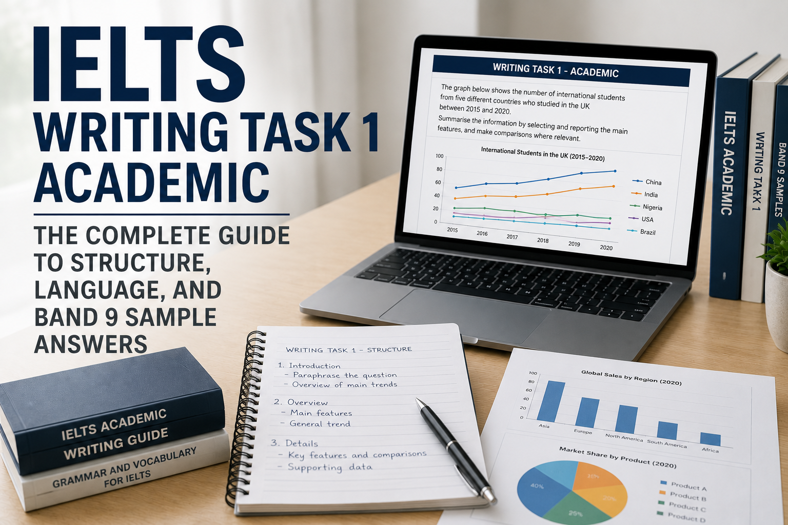
Writing Task 1 Academic: The Complete Guide to Structure, Language, and Band 9 Sample Answers
IELTS Writing Task 1 has something of an image problem among candidates preparing for the test. Because it counts for roughly half as much as Task 2 in your overall Writing band score, and because candidates are advised to spend only about 20 of their 60 available minutes on it, it's easy to treat Task 1 as the lesser task — something to get through efficiently so more time and energy can go toward the essay. That instinct isn't entirely wrong about time allocation, but it's badly wrong about preparation. Task 1 has its own distinct structure, its own specific language demands, and its own set of avoidable mistakes that quietly cap otherwise strong candidates well below their actual ability — and because it's scored on the same four criteria as Task 2, a weak Task 1 response drags down your overall Writing band just as directly as a weak essay does.
This guide covers everything a candidate needs to genuinely master Task 1: the official band descriptors in full, a universal four-part structure that works across every visual data type, dedicated sections on each of the seven chart and diagram categories IELTS actually uses (bar graphs, line graphs, pie charts, tables, process diagrams, maps, and mixed or combination charts), the specific language patterns each type demands, a full Band 9 sample response for every category plus several additional worked examples covering less common variations, a direct Band 6 versus Band 9 side-by-side comparison annotated against the actual scoring criteria, the mistakes that most commonly cap scores well below a candidate's real ability, a deep dive into sentence-level grammar patterns specific to this task, and a structured practice plan for building this skill in the weeks before your exam.
This guide was researched and verified using IELTS's own official test-format pages and publicly available official IELTS Writing band descriptor documentation. Where a specific descriptor phrase is quoted directly from official sources, it's marked as such; broader technique guidance throughout reflects widely accepted, well-established IELTS preparation practice rather than official Pearson or IELTS wording, and is presented with that distinction made clear rather than blurring the two together.
What Is IELTS Writing Task 1 Academic, Exactly?
In the IELTS Academic Writing test, Task 1 presents you with visual information — a graph, table, chart, map, or process diagram — and asks you to describe, summarize, or explain the data in your own words. You're expected to identify the main trends or features, make relevant comparisons where the data supports them, and provide a clear overview of the information, all without including your own opinion, since Task 1 is a descriptive and analytical task, not an argumentative one the way Task 2 is.
The mechanical requirements are specific and worth knowing precisely: a minimum of 150 words (falling short of this word count directly costs marks under the Task Achievement criterion), and a suggested time allocation of roughly 20 minutes, leaving the remaining 40 minutes of the 60-minute Writing test for Task 2. This time split isn't arbitrary — it reflects the fact that Task 2 counts twice as much as Task 1 toward your overall Writing band score, which is precisely why time-management guidance consistently recommends spending less time on Task 1 relative to Task 2, even though both tasks are scored against the same four criteria and both matter for your final band.
It's worth noting explicitly, since it's a common point of confusion: IELTS General Training's Task 1 is an entirely different task — a letter-writing exercise responding to an everyday situation — and the visual-data description task covered in this guide applies specifically to IELTS Academic. If you're preparing for General Training, the structural and language guidance in this specific guide doesn't transfer directly, though the underlying four scoring criteria are shared across both versions.
Why Task 1 Deserves More Preparation Than Its Weighting Suggests
It's tempting to conclude that because Task 2 counts for twice as much, Task 1 deserves proportionally less preparation time. This reasoning has a real flaw worth naming directly: Task 1's lower weighting applies to how much it counts within your Writing band, not to how quickly or easily it can be mastered. In practice, Task 1's structure and language are more mechanical and learnable than Task 2's — there's a specific, repeatable four-part structure that works across nearly every visual data type, and a defined, learnable set of trend-describing and comparison language that transfers directly across different charts and topics. This means Task 1 is actually one of the highest-leverage places to invest focused preparation time, since consistent, correct technique here is more reliably achievable in a short preparation window than the broader, less formulaic skill of essay argumentation that Task 2 demands.
There's also a specific trap worth naming: because Task 1 counts less, some candidates under-invest in it to the point of writing a genuinely weak response — missing the overview entirely, misreading the data, or falling short of the word count — and these are exactly the kinds of concrete, avoidable errors that cost real band-score points regardless of how strong the accompanying Task 2 essay is. A mediocre Task 1 response paired with an excellent Task 2 essay will not average out to your target overall Writing band if Task 1's specific requirements haven't been met, since Task Achievement failures (an unclear or missing overview, a response under the word count, addressing the wrong data) are penalized directly under the same four-criteria framework Task 2 uses.
Consider the arithmetic concretely: if Task 2 counts twice as much as Task 1, a candidate scoring a 6 on Task 1 and an 8 on Task 2 ends up with a weighted average closer to 7.3, meaningfully below what that same candidate would achieve with a 7 on Task 1 and an 8 on Task 2 — roughly 7.7. That single band's difference on Task 1, despite its lower weighting, is often the actual gap between a candidate's real overall Writing band and the target score their university or migration pathway actually requires. Task 1's lower weighting reduces its impact; it doesn't eliminate it, and treating the two as though only Task 2 matters is a measurable, avoidable strategic error.
The Official IELTS Writing Task 1 Band Descriptors
Understanding precisely what separates a Band 6 response from a Band 7, 8, or 9 response is the single most useful piece of information for targeted improvement, since vague goals like "write better" don't translate into specific, actionable changes. Task 1 is scored against the same four criteria as Task 2 — Task Achievement, Coherence and Cohesion, Lexical Resource, and Grammatical Range and Accuracy — though Task Achievement is defined differently for Task 1 than for Task 2's "Task Response," since Task 1 asks you to accurately describe given data rather than construct an original argument.
Band 9:
- Task Achievement: "fully satisfies all the requirements of the task"
- Coherence and Cohesion: "uses cohesion in such a way that it attracts no attention"
- Lexical Resource: "uses a wide range of vocabulary with very natural and sophisticated control"
- Grammatical Range and Accuracy: "uses a wide range of structures with full flexibility and accuracy"
Band 8:
- Task Achievement: "covers all requirements of the task sufficiently," with a clear presentation of key features
- Coherence and Cohesion: "sequences information and ideas logically" and "manages all aspects of cohesion well"
- Lexical Resource: "uses a wide range of vocabulary fluently and flexibly"
- Grammatical Range and Accuracy: "the majority of sentences are error-free"
Band 7:
- Task Achievement: "covers the requirements of the task," with a clear overview of main trends
- Coherence and Cohesion: "logically organises information and ideas; there is clear progression throughout"
- Lexical Resource: "uses a sufficient range of vocabulary to allow some flexibility and precision"
- Grammatical Range and Accuracy: "produces frequent error-free sentences," with good overall grammar control
Band 6:
- Task Achievement: "addresses the requirements of the task" appropriately
- Coherence and Cohesion: "arranges information and ideas coherently," with clear overall progression
- Lexical Resource: "uses an adequate range of vocabulary for the task"
- Grammatical Range and Accuracy: "makes some errors in grammar and punctuation but they rarely reduce communication"
Band 5:
- Task Achievement: "generally addresses the task," though the format may be inappropriate in places
- Coherence and Cohesion: "presents information with some organisation but there may be a lack of overall progression"
- Lexical Resource: "uses a limited range of vocabulary, but this is minimally adequate for the task"
- Grammatical Range and Accuracy: "may make frequent grammatical errors and punctuation may be faulty"
What this tells you practically: the jump from Band 6 to Band 7 and above is defined largely by precision and consistency — a "sufficient range of vocabulary to allow some flexibility and precision" (Band 7) versus an "adequate range" (Band 6) is a meaningful, specific distinction, not just a vaguer sense of "better." Similarly, the difference between "logically organises" (Band 6) and "sequences information and ideas logically" with cohesion managed "well" (Band 8) reflects genuinely tighter paragraph structure and more deliberate use of cohesive devices, not just longer or more complex sentences for their own sake.
The Universal Four-Part Task 1 Structure
Nearly every high-scoring Task 1 response follows the same underlying four-part structure, regardless of whether the visual data is a bar graph, a process diagram, or a map. Internalizing this structure removes a huge amount of decision-making under real time pressure, since you're not inventing an organizational approach from scratch for each new chart type — you're applying a proven, repeatable framework.
Paragraph 1 — Introduction (one sentence, paraphrased). Restate what the chart or diagram shows, in your own words, without copying the question's wording directly. This is a single sentence, not a full paragraph of throat-clearing.
Paragraph 2 — Overview (two to three sentences). Identify the two or three most significant overall trends or features, without specific data points — this is the single most heavily weighted paragraph for Task Achievement, covered in detail in the next section.
Paragraph 3 — Body Paragraph 1 (specific details, one category or time period). Describe specific data points and figures supporting one logical grouping of the information — for a line graph, this might be the first half of the time period or the categories showing an upward trend; for a table, this might be one row or column grouping.
Paragraph 4 — Body Paragraph 2 (specific details, the remaining category or time period). Cover the remaining data not addressed in Body Paragraph 1, again with specific supporting figures.
This four-paragraph structure — introduction, overview, and two body paragraphs — is flexible enough to accommodate every visual data type covered in this guide, while providing enough consistent structure that examiners can clearly follow your organizational logic, directly supporting the Coherence and Cohesion criterion.
The Overview: The Single Most Important Paragraph in Task 1
If there's one specific technique that separates Band 5-6 responses from Band 7 and above, it's the overview paragraph — and it's worth understanding exactly why it matters so disproportionately.
What an overview actually is. A concise summary, in your own words, of the two or three most significant overall trends, patterns, or features in the data — without citing specific numbers. If the data shows multiple categories rising and falling over time, the overview identifies which categories showed the most dramatic overall change, which stayed relatively stable, and what the general overall pattern was, in broad terms.
Why it's weighted so heavily. Task Achievement's band descriptors explicitly reference "a clear overview of main trends" as a defining feature of Band 7 responses, and its absence is one of the most consistently cited reasons a response gets capped at Band 5 or 6 regardless of how detailed or grammatically accurate the rest of the response is. An examiner reading a Task 1 response without a clear, distinct overview paragraph has no direct evidence that you can step back from the raw data and identify what actually matters — which is the core analytical skill Task 1 is designed to test.
A common, costly mistake: mixing the overview into the introduction, or omitting it entirely in favor of jumping straight into specific data points. A response that goes directly from a one-sentence paraphrase of the question into detailed body paragraphs full of specific figures, without ever explicitly stepping back to summarize the big picture, will very likely be capped below Band 7 regardless of the quality of everything else in the response.
What a strong overview looks like in practice. Take a line graph showing the population of four countries from 1990 to 2020. A weak, missing, or vague overview might simply restate the introduction. A strong overview would look something like: "Overall, the population of Country A grew substantially throughout the period, while Country B experienced a steady decline. Countries C and D remained comparatively stable, with only minor fluctuations." Notice this contains no specific numbers or years — it's a genuine, big-picture summary, distinct from the specific-detail work that belongs in the body paragraphs that follow.
Paraphrasing the Question: Turning a Prompt Into a Genuine Introduction
The introduction sentence is worth its own dedicated attention, since it's the first thing an examiner reads and sets an immediate impression of your Lexical Resource before the rest of the response even begins.
The core technique is substituting synonyms, restructuring sentence order, and changing word forms (nouns to verbs, adjectives to adverbs) while preserving the original meaning exactly — not adding new information, and not changing what the chart actually shows.
Worked example 1. Question prompt: "The bar chart below shows the percentage of households with internet access in four countries between 2000 and 2020." A weak, copied introduction: "The bar chart below shows the percentage of households with internet access in four countries between 2000 and 2020." A genuine paraphrase: "The given bar chart illustrates the proportion of households possessing internet connectivity across four nations over a twenty-year period, from 2000 to 2020."
Worked example 2. Question prompt: "The line graph illustrates the amount of electricity produced from three renewable sources in the UK from 2003 to 2023." A genuine paraphrase: "The line graph presents data on the volume of electricity generated using three renewable energy sources in the United Kingdom over a two-decade period ending in 2023."
Worked example 3. Question prompt: "The table below gives information about the number of visitors to four museums in one city in 2015 and 2025." A genuine paraphrase: "The table provides a comparison of visitor numbers at four museums located in a single city, contrasting figures from 2015 with those recorded a decade later, in 2025."
Worked example 4. Question prompt: "The diagram shows the process of making chocolate from cocoa beans." A genuine paraphrase: "The diagram depicts the various stages involved in producing chocolate, beginning with raw cocoa beans and ending with the finished product."
Common paraphrasing substitutions worth building fluency with: "shows/illustrates/depicts/presents/gives information about," "the percentage of" → "the proportion of," "between X and Y" → "over a period spanning X to Y" or "from X to Y," "the number of" → "the quantity of" or "the figures for," "in four countries" → "across four nations." Building a working familiarity with these kinds of substitutions — rather than memorizing entire fixed introduction templates — produces more natural, varied introductions that hold up across genuinely different chart topics.
Cohesive Devices: Linking Your Ideas Without Overusing Connectors
Coherence and Cohesion — one of the four scoring criteria — depends heavily on how smoothly your ideas connect across sentences and paragraphs, and Task 1 responses have their own characteristic set of cohesive devices worth knowing well, separate from the more argument-focused connectors typically emphasized in Task 2 preparation.
Adding a further point within the same category: "In addition," "Furthermore," "Similarly," "Likewise."
Signaling contrast between categories or time periods: "In contrast," "By contrast," "Conversely," "Whereas," "While" (used within a single sentence, as in "While Country A's figures rose, Country B's declined").
Referring back to previously mentioned data without repeating it verbatim: "this figure," "this trend," "this proportion," "the former/the latter" (useful specifically when discussing exactly two categories).
Signaling the most significant point among several: "Most notably," "Most strikingly," "In particular," "Especially."
A common overcorrection worth avoiding: using an excessive number of formal connectors in every single sentence, which paradoxically damages Coherence and Cohesion rather than helping it, since the official Band 8-9 descriptors specifically reward cohesion that "attracts no attention" — meaning it should feel natural and unobtrusive, not conspicuously connector-heavy. A response using "Furthermore," "Moreover," and "In addition" in three consecutive sentences reads as mechanical rather than genuinely cohesive; varying between explicit connectors and more subtle techniques (pronoun reference, deliberate word repetition of a key term, logical paragraph ordering) produces a more natural-sounding, higher-scoring result.
How Examiners Actually Mark Your Task 1 Response
Unlike PTE's largely automated scoring, IELTS Writing is marked by trained human examiners, working from the official band descriptors covered earlier in this guide, and understanding the general marking process demystifies what might otherwise feel like an opaque, subjective evaluation.
Examiners assess against all four criteria independently, then combine them. Rather than forming one overall impression of a response, examiners work through Task Achievement, Coherence and Cohesion, Lexical Resource, and Grammatical Range and Accuracy as four genuinely separate assessments, each assigned its own band score, which are then combined (alongside Task 2's scores, weighted twice as heavily) into your overall Writing band. This is why a response can be simultaneously strong in one area (say, grammatical accuracy) and weak in another (say, a missing overview damaging Task Achievement) — the four criteria don't average into a single vague impression, they're assessed and reported distinctly.
Examiners are trained to apply consistent standards through calibration exercises, in which multiple examiners mark the same sample responses and compare results against the official band descriptors to maintain consistency across different examiners and test centers worldwide. This is part of why the specific wording in the band descriptors (covered earlier in this guide) is worth reading closely — it's the actual working document examiners are trained against, not a loose approximation of what they're looking for.
Word count is checked directly, and falling short is penalized specifically under Task Achievement, not as some vague, generalized penalty — examiners are instructed to identify under-length responses explicitly, which is why the 150-word minimum is a hard, mechanical threshold rather than a rough guideline.
Examiners read for the overview specifically, as a distinct, identifiable element of the response. Because "a clear overview of main trends" is explicitly named in the official Band 7 descriptor, examiners are specifically looking for a genuine overview as a distinguishable part of the response — not just checking whether the general gist of the data has been communicated somewhere within the response as a whole.
Chart Type 1: Bar Graphs
Bar graphs are among the most common Task 1 visual types, typically comparing quantities across different categories, sometimes at a single point in time and sometimes across multiple time periods (a "cluster" bar graph with grouped bars for each category).
Key language for bar graphs: comparative structures ("significantly higher than," "roughly double," "considerably lower than"), superlatives for identifying extremes ("the highest," "the lowest," "the most significant"), and static-comparison vocabulary if there's no time element involved ("accounted for," "represented," "made up").
Sample Band 9 response (for a hypothetical bar graph comparing average weekly hours spent on four leisure activities — Reading, Gaming, Sports, and Socializing — across three age groups: Teenagers, Adults, and Seniors):
"The bar graph illustrates the average number of hours per week that teenagers, adults, and seniors in a particular country spent on four leisure activities: reading, gaming, sports, and socializing.
Overall, socializing was the most popular leisure activity across all three age groups, while gaming showed the most significant variation, being far more prevalent among teenagers than among the other two groups. Sports participation, by contrast, declined steadily with age.
Teenagers spent considerably more time gaming than any other group, averaging around 12 hours per week, compared to roughly 4 hours for adults and just 1 hour for seniors. Reading followed a broadly opposite pattern, with seniors dedicating approximately 8 hours weekly to this activity, nearly double the figure recorded for teenagers.
In terms of socializing, all three groups spent a comparatively similar amount of time, ranging from 9 to 11 hours weekly, making this the most consistent activity across age groups. Sports, meanwhile, occupied roughly 7 hours of teenagers' weekly schedules, falling to around 5 hours for adults and just 2 hours for seniors."
(Word count: 189 — comfortably above the 150-word minimum, with a clear introduction, a genuine overview identifying the two most significant patterns, and two body paragraphs covering the remaining specific data.)
Chart Type 2: Line Graphs
Line graphs typically show change over time — a trend across months, years, or decades — and are one of the most common Task 1 formats precisely because they reward the trend-describing vocabulary that's among the most learnable, transferable language in the entire Writing test.
Key language for line graphs: verbs describing movement ("rose," "increased," "climbed," "declined," "fell," "dropped," "fluctuated," "remained stable/steady," "plateaued"), adverbs describing the manner or speed of change ("sharply," "dramatically," "gradually," "steadily," "slightly," "marginally"), and prepositional phrases anchoring change to specific points ("from X to Y," "by X percent," "to a peak of X," "before falling to X").
Sample Band 9 response (for a hypothetical line graph showing the number of electric vehicles sold annually in four countries from 2015 to 2025):
"The line graph depicts the number of electric vehicles sold annually in four countries — the United States, Germany, Japan, and China — between 2015 and 2025.
Overall, electric vehicle sales increased substantially across all four countries over the period, with China experiencing by far the most dramatic growth. Japan, by contrast, showed the slowest and most gradual increase throughout the decade.
China's electric vehicle sales rose sharply from approximately 200,000 units in 2015 to over 4 million by 2025, with particularly steep growth occurring after 2020. The United States followed a broadly similar upward trajectory, though at a considerably lower volume, climbing from around 100,000 units to just under 1.5 million over the same period.
Germany's sales figures increased steadily but more moderately, reaching approximately 800,000 units by 2025, having started at roughly 50,000. Japan's growth was the most gradual of the four, rising from around 30,000 units to only 250,000 by the end of the period, never surpassing the other three countries at any point during the decade."
(Word count: 176 — a clear overview correctly identifying both the most dramatic and the most gradual trends, with body paragraphs grouping countries logically by growth pattern rather than simply listing them in the order presented.)
Chart Type 3: Pie Charts
Pie charts show proportional data — how a whole is divided into parts — and can appear as a single chart or, more challengingly, as two or more pie charts requiring comparison (for instance, the same category breakdown at two different points in time).
Key language for pie charts: proportion vocabulary ("accounted for," "made up," "represented," "constituted"), fraction and percentage phrasing ("just under a third," "slightly more than half," "a negligible proportion"), and — when comparing two pie charts — the same trend-describing language used for line graphs, since a comparison across two time points is itself a form of change over time.
Sample Band 9 response (for two hypothetical pie charts showing the breakdown of a household's monthly expenses in 2010 versus 2025):
"The two pie charts compare how a typical household allocated its monthly expenses across five categories — housing, food, transportation, entertainment, and savings — in 2010 and 2025.
Overall, the proportion of income spent on housing increased considerably over the period, becoming the dominant expense category by 2025, while the share allocated to savings declined notably. Spending on food and transportation remained relatively stable across both years.
In 2010, housing accounted for just under a third of monthly expenses, at 30%, while savings made up a comparatively healthy 20% share. Food and transportation each represented around 20% and 15% respectively, with entertainment accounting for the remaining 15%.
By 2025, housing's share had risen to 42%, becoming by far the largest single category, while savings had fallen to just 8% of monthly expenses. Food spending remained close to its earlier level at 18%, transportation held steady at 14%, and entertainment's share decreased slightly to 8%."
(Word count: 168 — note the overview correctly identifies the two most significant changes across both charts before the body paragraphs break down each individual chart's specific figures.)
Chart Type 4: Tables
Tables present data in rows and columns, often combining multiple categories and time periods simultaneously, which makes them simultaneously flexible in what they can show and demanding in terms of selecting which data points are actually worth including, since a table often contains more raw numbers than could reasonably fit into a 150-to-200-word response.
Key language for tables: the same comparative and trend-describing vocabulary used for bar graphs and line graphs applies, combined with careful selection language ("notably," "particularly," "most strikingly") to signal which specific figures you've deliberately chosen to highlight from a larger dataset, since a table response should never attempt to describe every single number in the table.
Sample Band 9 response (for a hypothetical table showing internet usage rates, in percent of population, across five countries in 2005, 2015, and 2025):
"The table shows the percentage of the population using the internet in five countries — Brazil, India, Nigeria, South Korea, and the United Kingdom — in 2005, 2015, and 2025.
Overall, internet usage increased dramatically across all five countries over the twenty-year period, though South Korea and the United Kingdom started from a considerably higher base than the other three nations. India recorded the most significant overall increase in percentage-point terms.
In 2005, South Korea and the United Kingdom already had relatively high internet penetration, at 65% and 58% respectively, while Brazil, India, and Nigeria lagged considerably behind, with figures ranging from just 3% to 12%. By 2015, all five countries had seen substantial growth, with South Korea reaching 90% and the United Kingdom 89%, while India had risen to 27% and Nigeria to 34%.
By 2025, South Korea and the United Kingdom had both approached full internet saturation, at 97% and 95% respectively. India showed the most dramatic overall change, climbing to 68% from a starting point of just 3% two decades earlier, while Nigeria and Brazil reached 61% and 84% respectively."
(Word count: 179 — note the response deliberately selects and highlights specific, meaningful figures rather than attempting to recite every cell in the table, and explicitly signals in the overview which country showed the most significant change.)
Chart Type 5: Process Diagrams
Process diagrams show the stages of a process — a manufacturing procedure, a natural cycle (like the water cycle), or a sequence of steps — and require a meaningfully different approach than data-comparison charts, since there's no numerical trend to describe, only a sequence of stages to explain clearly and in the correct order.
Key language for process diagrams: sequencing language ("first," "next," "following this," "subsequently," "once X has occurred," "finally"), and — critically — the passive voice, since most process diagrams describe things being done to a subject (materials being processed, water being evaporated) rather than an active agent performing the action, making the passive voice the grammatically appropriate and natural-sounding choice for this task type specifically.
Sample Band 9 response (for a hypothetical process diagram showing the stages of manufacturing paper from raw wood):
"The diagram illustrates the process by which paper is manufactured, beginning with raw timber and ending with the finished product ready for use.
Overall, the process involves seven distinct stages, moving from the initial harvesting of trees through several stages of mechanical and chemical processing before the paper is finally cut and packaged for distribution.
The process begins with trees being felled and transported to a processing facility, where the bark is removed and the wood is chipped into small fragments. These wood chips are then combined with water and chemicals in a large vessel, where they are cooked under high pressure to break down the fibers into a pulp.
Once the pulp has been produced, it is bleached to remove discoloration and then spread thinly across a moving mesh screen, where excess water is drained away. The resulting sheet is subsequently pressed and dried using heated rollers, before being wound onto large rolls. Finally, the paper is cut to the required size and packaged for distribution to consumers."
(Word count: 172 — note the consistent use of passive voice throughout, since the paper is the subject being acted upon at every stage, and the clear sequencing language guiding the reader through each distinct step in order.)
Chart Type 6: Maps
Map tasks show a location — a town, building, or region — at two or more different points in time, and require you to describe the specific changes that occurred between them, focusing on what was added, removed, expanded, or relocated.
Key language for maps: change-describing vocabulary specific to physical space ("was replaced by," "was converted into," "was demolished," "was constructed," "was extended," "was relocated to"), and directional/positional language ("to the north of," "adjacent to," "in the vicinity of," "along the eastern edge of").
Sample Band 9 response (for a hypothetical pair of maps showing a small coastal town in 1990 and in 2025):
"The two maps illustrate the changes that took place in a small coastal town between 1990 and 2025.
Overall, the town underwent substantial development over the period, with significant new residential and commercial construction alongside the loss of much of its original agricultural land. The town's population center clearly shifted further inland by 2025.
In 1990, the town consisted primarily of a small fishing harbor, a handful of residential streets close to the coast, and extensive farmland to the north and east. By 2025, the harbor area had been redeveloped into a marina with adjacent restaurants and shops, while the original residential streets had been considerably expanded further inland.
Much of the farmland that previously bordered the town to the north had been converted into a new residential district, complete with a school and a small shopping center that did not exist in 1990. A new road connecting the town to the nearby highway had also been constructed, running along what had previously been open farmland to the east."
(Word count: 168 — note the overview identifies the two most significant overall patterns of change before the body paragraphs work through the specific before-and-after details methodically, moving logically from the coastal area inward.)
Chart Type 7: Mixed or Combination Charts
Some Task 1 prompts combine two different visual formats — for instance, a bar graph paired with a pie chart, or a line graph alongside a table — covering related but distinct aspects of the same overall topic. These require the same universal four-part structure, but with body paragraphs organized around which specific chart or data type they cover, rather than by time period or category alone.
Key approach for combination charts: treat the overview as an opportunity to identify the single most important connection or contrast between the two visual elements, and organize your two body paragraphs so that each one primarily addresses one of the two charts, rather than trying to interweave both simultaneously in a way that risks becoming confusing to follow.
Sample Band 9 response (for a hypothetical combination of a bar graph showing renewable energy production by source in one country, alongside a pie chart showing that same country's total electricity generation mix):
"The bar graph shows the amount of electricity generated from three renewable sources — solar, wind, and hydroelectric power — in a particular country between 2015 and 2025, while the pie chart illustrates that country's overall electricity generation mix in 2025.
Overall, renewable energy production increased substantially across all three sources over the decade, with wind power showing the most significant growth. Despite this increase, the pie chart reveals that renewable sources still accounted for a relatively modest share of the country's total electricity generation by 2025.
Wind power output grew most dramatically, rising from approximately 5 terawatt-hours in 2015 to 40 terawatt-hours by 2025. Solar power followed a similar upward trend, though from a lower base, reaching around 25 terawatt-hours, while hydroelectric power grew only modestly, from 15 to 20 terawatt-hours over the same period.
Despite this growth, the pie chart shows that combined renewable sources made up only 22% of the country's total electricity generation in 2025, with fossil fuels still accounting for the majority share at 61%, and nuclear power contributing the remaining 17%."
(Word count: 175 — note how the overview explicitly draws the connecting insight between the two charts — strong renewable growth in absolute terms, but still a modest overall share — rather than describing each chart in complete isolation from the other.)
Additional Worked Samples: Less Common But Still Possible Variations
Beyond the seven core chart types covered above, a handful of less common but still genuinely possible Task 1 variations are worth practicing specifically, since candidates who've only ever seen the standard formats can be caught off guard by these on exam day.
Two Separate Bar Graphs Requiring Combined Analysis
Some prompts present two related bar graphs rather than one — for instance, one showing a quantity by category, and a second showing the same categories broken down by a different variable (like region or gender).
Sample Band 9 response (for two hypothetical bar graphs: one showing total university enrollment by subject area in one country, the second showing the same subject areas broken down by gender):
"The first bar graph shows total university enrollment across five subject areas in a particular country, while the second breaks down enrollment in those same five subjects by gender.
Overall, Business and Engineering were the two most popular subjects by total enrollment, while the gender breakdown reveals a stark contrast between subjects, with Engineering strongly male-dominated and Nursing strongly female-dominated.
Business attracted the highest total enrollment, at approximately 45,000 students, followed closely by Engineering at 42,000. Arts and Nursing each attracted around 30,000 students, while Computer Science trailed with just 18,000 total enrollments.
Examining the gender breakdown, Engineering enrollment was approximately 80% male, the most heavily skewed of any subject, while Nursing showed the opposite pattern, with roughly 85% female enrollment. Business and Arts were considerably more balanced, each showing a roughly 55-45 split, while Computer Science leaned moderately male at around 65%."
(Word count: 168 — note how the overview explicitly connects the two charts' most important joint insight — total popularity versus gender imbalance — rather than treating them as entirely separate, disconnected pieces of information.)
A Line Graph With an Unusual or Non-Standard Unit
Occasionally a line graph uses a less intuitive unit of measurement (an index score, a rate per 1,000 people, or similar), which can create hesitation if a candidate isn't sure how to describe the unit itself.
Sample Band 9 response (for a hypothetical line graph showing an air quality index, where higher numbers indicate worse air quality, across four cities from 2010 to 2025):
"The line graph shows an air quality index score, where higher figures represent poorer air quality, for four major cities between 2010 and 2025.
Overall, air quality improved considerably in two of the four cities over the period, while it worsened significantly in the other two, indicating a divergent overall pattern rather than a single uniform trend.
City A's index score fell steadily from around 150 in 2010 to just 60 by 2025, indicating a substantial improvement in air quality, while City B followed a broadly similar declining pattern, from 130 down to 75.
In contrast, City C's index rose from a relatively low starting point of 40 in 2010 to a concerning 110 by 2025, while City D showed the most dramatic deterioration, climbing from 55 to 140 over the same period, ultimately recording the worst air quality of all four cities by the end of the period."
(Word count: 165 — note the explicit clarification of what the unit represents ("where higher figures represent poorer air quality") appears early, ensuring the direction of "improvement" versus "deterioration" is unambiguous throughout the response.)
A Pie Chart With Many Small Categories
Some pie charts include six or more categories, several of which may be quite small — a case where attempting to describe every single slice individually produces an overly long, list-like response.
Sample Band 9 response (for a hypothetical pie chart showing a company's revenue breakdown across seven product categories):
"The pie chart illustrates a company's revenue breakdown across seven product categories for a given financial year.
Overall, two categories — Software and Hardware — together accounted for well over half of total revenue, while the remaining five categories each contributed comparatively minor shares.
Software generated the largest share of revenue, at 34%, followed closely by Hardware at 28%, together making up 62% of the company's total revenue. Consulting Services contributed a further 15%, making it the third-largest category by a clear margin.
The remaining four categories — Training, Support, Licensing, and Miscellaneous Other Services — each accounted for a relatively small proportion of total revenue, ranging from just 3% to 8%, collectively making up the remaining 23%."
(Word count: 141 — slightly under the usual target range, illustrating that even a chart with many categories doesn't require individually describing every single slice; grouping the smaller categories together as "the remaining four categories" is an acceptable and often necessary simplification technique.)
Handling Unusual or Ambiguous Data Presentations
Occasionally a Task 1 prompt presents data in a less standard way than the seven core chart types covered in this guide, and it's worth having a general strategy for these situations rather than being caught entirely unprepared.
Scatter plots. Less common than the core chart types but occasionally used, scatter plots show the relationship between two variables across many individual data points, rather than discrete categories or time periods. The appropriate approach is to describe the overall pattern or correlation shown (for instance, "there appears to be a positive correlation between X and Y, with higher values of X generally associated with higher values of Y") rather than attempting to describe individual data points.
Charts with a break or interruption in the axis. Some charts use a visual break to accommodate a wide data range without wasting space — this doesn't change your descriptive approach, but it's worth reading the axis carefully to avoid misreading the actual values being shown.
Data with genuinely unclear or ambiguous labeling. If a chart's labeling is unclear about what a specific figure represents, focus your response on the patterns and comparisons that are clearly and unambiguously shown, rather than guessing at an unclear detail and potentially describing something inaccurately.
Percentage data that doesn't sum to exactly 100%. Due to rounding in the original data, percentage breakdowns occasionally sum to 99% or 101% rather than exactly 100% — this is a normal feature of real-world rounded data and doesn't require comment or correction in your response.
Language for Describing Trends and Change Over Time
Beyond the chart-specific vocabulary covered above, a broader bank of trend-describing language is worth building deliberately, since this vocabulary transfers across nearly every Task 1 chart type involving change over time.
Verbs for upward movement: rose, increased, grew, climbed, surged, soared, rocketed, picked up.
Verbs for downward movement: fell, declined, dropped, decreased, plummeted, slumped, dipped.
Verbs for stability: remained stable, remained steady, held constant, plateaued, leveled off.
Verbs for fluctuation: fluctuated, varied, oscillated.
Adverbs describing the degree or speed of change: dramatically, sharply, considerably, substantially, significantly (for large changes); gradually, steadily, moderately (for medium-paced changes); slightly, marginally, negligibly (for small changes).
Phrases anchoring change to specific data points: "rose from X to Y," "increased by X percent," "reached a peak of X before falling to Y," "doubled/tripled/halved over the period."
Building fluency with this specific vocabulary bank, and practicing varying your word choice rather than repeating "increased" or "decreased" throughout an entire response, directly supports the Lexical Resource criterion, which explicitly rewards a "wide range of vocabulary" at the higher bands.
Language for Static Comparisons and Proportions
For chart types without a clear time element — a single bar graph or pie chart showing data at one point in time, or a table comparing categories rather than tracking change — a different vocabulary set applies.
Comparison language: "significantly higher/lower than," "roughly twice as much as," "considerably more than," "on a par with," "comparable to," "in stark contrast to."
Proportion language: "accounted for," "made up," "represented," "constituted," "comprised."
Ranking and extremes language: "the highest proportion," "the most significant category," "the smallest share," "the majority of," "a minority of," "the vast majority."
Mixing both the trend-based and static-comparison vocabulary banks appropriately — using trend language only where genuine change over time is being described, and static-comparison language for single-point or category-based comparisons — is itself a mark of the "flexibility and precision" the higher band descriptors specifically reward.
Grammar Structures Worth Mastering for Task 1
Beyond vocabulary, a handful of specific grammatical structures come up disproportionately often in strong Task 1 responses, and deliberately practicing them pays off directly under the Grammatical Range and Accuracy criterion.
Comparative and superlative structures. "Country A's figure was considerably higher than Country B's," "the largest increase occurred in," "the most significant decline was seen in" — these structures are essential across nearly every chart type and are worth being able to construct fluently and with varied sentence patterns, rather than relying on the same one or two comparative forms throughout an entire response.
The passive voice, particularly for process diagrams. As covered in the process-diagram section, most process descriptions naturally call for passive constructions ("the wood is chipped," "the pulp is bleached") since the process's subject is typically acted upon rather than acting.
Appropriate tense selection. Data covering a historical time period (past years) calls for past tense throughout; data projecting into the future calls for future tense or future-oriented structures ("is expected to," "is projected to"); data with no explicit time reference (a single-point-in-time bar graph or pie chart) is typically described in the present tense.
Complex sentences combining a general statement with specific supporting data. Sentences like "While housing costs rose consistently across the period, the increase was most pronounced between 2015 and 2020, when prices climbed by nearly 30%" demonstrate the kind of sentence complexity and precision that higher-band responses require, combining a general clause with a specific, data-supported clause in a single well-constructed sentence.
Building a Genuine Vocabulary Bank: Before-and-After Sentence Upgrades
Rather than presenting an abstract word list, it's more useful to see how a genuinely mid-range (Band 6) sentence can be upgraded toward a Band 8-9 standard through specific, deliberate vocabulary and structural choices — the same kind of transformation worth practicing on your own draft responses.
Before (Band 6 level): "The number of people who used the internet went up a lot between 2010 and 2020." After (Band 8-9 level): "Internet usage rose substantially between 2010 and 2020, more than doubling over the decade." What changed: "went up a lot" (vague, informal) became "rose substantially... more than doubling" (precise, quantified, more formal register).
Before: "The graph shows that Country A had more cars than Country B in every year." After: "Throughout the period under review, Country A consistently recorded a higher number of registered vehicles than Country B." What changed: "the graph shows that" (a weak, generic opener) was replaced with a more analytical framing, and "had more cars" became the more formal, precise "recorded a higher number of registered vehicles."
Before: "Housing costs went down a little bit in 2015 but then went back up again." After: "Housing costs dipped slightly in 2015 before recovering and continuing their upward trajectory." What changed: "went down a little bit" and "went back up again" (repetitive, informal phrasing) became "dipped slightly" and "recovering and continuing their upward trajectory" (varied, precise verb choices avoiding repetition of "went").
Before: "Most of the pie chart is taken up by transport costs, which is 45%." After: "Transport costs represented the largest single expense category, accounting for nearly half of total spending at 45%." What changed: the awkward "is taken up by" construction was replaced with more natural proportion vocabulary ("represented," "accounting for"), and "45%" was contextualized with "nearly half" to demonstrate genuine numerical fluency rather than simply repeating the raw figure.
Before: "First you cut the wood. Then you put it in water. Then you wait for it to dry." After: "The wood is first cut into smaller pieces, after which it is submerged in water before being left to dry." What changed: the repetitive "Then you..." structure (also incorrectly using active "you," which doesn't fit the impersonal, process-description register) was replaced with connected passive-voice sentences and appropriate sequencing language.
Practicing this kind of before-and-after upgrade exercise on your own early draft responses — identifying vague, repetitive, or overly simple phrasing and deliberately rewriting it — is one of the most effective ways to internalize the vocabulary and grammar range that separates Band 6 from Band 8-9 responses, since it's grounded in your own actual writing patterns rather than an abstract, disconnected word list.
A Final Three-Minute Review Checklist
With roughly 20 minutes allocated to Task 1, reserving a genuine, disciplined three minutes at the end for review — rather than continuing to write until time runs out — catches exactly the kind of avoidable errors that otherwise quietly cap an already strong response.
Word count check. Quickly estimate whether you've cleared 150 words — most candidates can learn to estimate this reasonably accurately by counting lines and average words per line, without needing to count every single word individually under time pressure.
Overview check. Confirm there's a genuine, identifiable overview paragraph present, distinct from the introduction, covering the two or three most significant overall patterns without specific numbers.
Opinion check. Scan quickly for any phrase resembling a personal opinion or unsupported speculation about causes, since these are Task Achievement risks specific to Task 1 that don't belong in a descriptive, data-based response.
Repetition check. Look for any word (especially trend verbs like "increased" or "decreased") repeated more than twice or three times, and consider whether a synonym could replace at least one instance to demonstrate vocabulary range.
Tense consistency check. Confirm the tense used throughout matches what the data actually shows — consistently past tense for historical data, future-oriented language for projections, present tense for single-point-in-time data with no explicit time reference.
Basic grammar and spelling scan. A quick read-through specifically looking for obvious subject-verb agreement errors, missing articles, or spelling mistakes in key vocabulary — not a full line-by-line edit, which the remaining time doesn't allow, but a targeted pass for the most common, easily-caught error types.
A Deeper Look at Sentence-Level Grammar for Task 1
Beyond the broad grammatical structures already covered, a few specific sentence-level patterns deserve closer attention, since they appear constantly across Task 1 responses regardless of chart type and are frequently a source of small, avoidable errors.
Subject-verb agreement with collective and percentage-based subjects. Constructions like "the majority of respondents were" (not "was," since "respondents" is the actual grammatical subject) or "a total of 45% of households owned" (agreement follows the noun being counted, not the percentage figure itself) trip up even otherwise strong candidates under time pressure. Deliberately practicing sentences with percentage- and proportion-based subjects builds the instinct to check agreement carefully in exactly the sentence types Task 1 uses constantly.
Correct preposition use with numerical change. English requires specific prepositions with specific verbs describing change: "rose by 15%" (not "rose 15%" or "rose in 15%"), "increased from X to Y" (not "increased from X until Y"), "fell to X" (not "fell until X"). These are memorizable, fixed patterns worth deliberately drilling, since preposition errors are common even among candidates with otherwise strong overall grammar.
Article use with countable and uncountable nouns in data description. "The number of visitors" (countable, requires "the") versus "an increase in population" (uncountable in this context, no article needed before "population") — article errors are subtle but noticeable to examiners and directly affect the Grammatical Range and Accuracy score.
Correct comparative structure with "than." "Considerably higher than" (not "considerably higher that" or "considerably more high than") — a small but surprisingly common error, particularly under the time pressure of a live exam, worth specifically checking for during your final review pass.
Parallel structure in lists. When listing multiple categories or trends within a single sentence, maintaining parallel grammatical structure across all items ("Sales of electronics, furniture, and clothing all increased" rather than mixing noun forms and verb forms awkwardly within the same list) demonstrates the sentence-level control that higher bands reward.
Using "respectively" correctly. This word is genuinely useful in Task 1 for efficiently reporting multiple figures in a single sentence — "Countries A, B, and C recorded growth rates of 5%, 8%, and 12% respectively" — but requires the items and figures to be listed in the exact same corresponding order on both sides of the sentence; using "respectively" with mismatched or ambiguous ordering creates genuine confusion rather than efficient precision.
Avoiding double comparatives and redundant intensifiers. Errors like "more higher" or "most highest" are basic but do occur under time pressure, and a quick review-phase check specifically for this kind of error is worth the small amount of time it takes.
Common Mistakes That Cap Task 1 Scores
Omitting the overview, or burying it inside another paragraph. As covered in detail earlier in this guide, this is one of the single most consistently cited reasons for a Task 1 response being capped at Band 5 or 6 regardless of overall writing quality.
Including personal opinion. Task 1 is a descriptive and analytical task — phrases like "I think this trend is concerning" or "in my opinion, this shows..." have no place in a Task 1 response and actively work against the Task Achievement criterion, which expects an objective description of the given data, not a personal reaction to it.
Describing every single data point rather than selecting the most significant ones. Particularly with data-dense tables or multi-category graphs, attempting to mention every single figure produces a cluttered, list-like response rather than an analytical one — strong responses deliberately select the most significant, illustrative data points rather than exhaustively cataloguing every number provided.
Falling short of the 150-word minimum. This is a directly, mechanically penalized error under Task Achievement — there's no ambiguity or partial credit here, and it's one of the most avoidable mistakes a well-prepared candidate can make.
Making up data not actually shown in the chart. Inventing plausible-sounding figures, trends, or explanations not actually supported by the given visual is a direct Task Achievement failure — Task 1 tests your ability to accurately describe what's genuinely there, not your ability to write convincingly about invented data.
Speculating about causes not shown in the data. Unless a chart explicitly provides reasons for a trend, speculating about why a trend occurred (for instance, "this increase was likely due to economic growth") goes beyond what Task 1 actually asks for, since you're describing given data, not explaining underlying causes the visual doesn't provide.
Using repetitive vocabulary and sentence structure throughout. A response using "increased" in every single sentence describing upward movement, or repeating the identical sentence structure across every data point, directly limits your Lexical Resource and Grammatical Range scores, even if every individual sentence is grammatically correct.
Copying phrasing directly from the question prompt. The introduction should be a genuine paraphrase in your own words, not a copied restatement of the exact wording given in the task prompt — direct copying doesn't demonstrate the paraphrasing skill Lexical Resource is specifically designed to assess.
Mismatching verb tense to the type of data shown. Using past tense for a chart showing projected future data, or present tense for clearly historical data, signals a lack of attention to what the chart is actually depicting and can create genuine confusion for the reader.
Spending too much of the allotted 60 minutes on Task 1. Given that Task 2 counts twice as much toward the overall Writing band, consistently overrunning your Task 1 time budget at Task 2's expense is a strategic, avoidable error separate from the content of the Task 1 response itself.
Writing an overview that's actually just a third body paragraph in disguise. Some candidates include a paragraph labeled as an overview that actually contains specific data points and figures — if a paragraph includes exact numbers, it's functioning as a body paragraph, not a genuine overview, regardless of where it's positioned in the response or what it's labeled.
Using overly casual or conversational language. Phrases like "a huge amount," "loads of people," or "things went crazy" are too informal for the academic register Task 1 expects, even though the underlying meaning might be accurate — formal, precise vocabulary is expected throughout.
Ignoring the specific chart type's conventional language in favor of generic phrasing. Using trend-describing language ("increased," "decreased") for a process diagram, or sequencing language ("first," "next") for a data-comparison chart, signals a misunderstanding of what the specific visual actually requires, even if the individual sentences are otherwise well-constructed.
Failing to make any comparisons where the data clearly supports them. Task Achievement explicitly rewards "relevant comparisons" where appropriate — a response that describes each data series or category in complete isolation, without ever explicitly comparing one to another, misses an opportunity to demonstrate the analytical connections the task is designed to test.
Writing a conclusion paragraph. Unlike Task 2, Task 1 doesn't require or benefit from a separate concluding paragraph restating what's already been said — the response should end naturally after the second body paragraph, without an added "in conclusion" summary that Task 1's format doesn't call for.
Managing Your 20 Minutes on Task 1
A reasonable time breakdown for the suggested 20-minute Task 1 window: roughly 2-3 minutes analyzing the chart and identifying the two or three key overview points before writing anything, roughly 12-14 minutes actually writing the four-paragraph response, and the remaining 3-4 minutes reviewing what you've written specifically for word count, overview clarity, and any obvious grammar or spelling errors.
Why the analysis phase matters disproportionately. Candidates who begin writing immediately, without first identifying the genuine overview points, often end up either omitting the overview entirely or writing a vague, unconvincing one after the fact, since they haven't actually done the analytical work of stepping back from the data before starting to write. Spending even two focused minutes identifying "what are the two or three biggest things this chart is telling me" before writing a single word produces a measurably stronger overview than attempting to identify it while already mid-sentence in the writing process.
Why the review phase matters. A quick final check specifically for word count (a response that feels complete but falls just under 150 words is an easily fixable, entirely avoidable Task Achievement penalty), for the presence and clarity of the overview, and for any repeated vocabulary that could be varied, catches exactly the kind of avoidable errors covered throughout this guide's common-mistakes section. Candidates who skip this final review phase entirely, using the full 20 minutes purely for writing, disproportionately report noticing these same avoidable errors only after submitting the response — at which point nothing can be corrected — making the discipline of reserving genuine review time one of the more consequential habits covered anywhere in this guide.
Task 1 vs. Task 2: What's Actually Different
| Factor | Task 1 (Academic) | Task 2 |
|---|---|---|
| Task type | Descriptive/analytical (visual data) | Argumentative (essay) |
| Word count minimum | 150 words | 250 words |
| Suggested time | ~20 minutes | ~40 minutes |
| Weight in Writing band | Counts once | Counts twice |
| Personal opinion | Not appropriate | Central to the task |
| Core skill tested | Selecting and describing key data accurately | Constructing and supporting an argument |
| Structure | Universal 4-part (intro, overview, 2 body) | Intro, 2-3 body paragraphs, conclusion |
| Scoring criteria | Same 4 criteria (Task Achievement instead of Task Response) | Task Response, Coherence & Cohesion, Lexical Resource, Grammatical Range & Accuracy |
Because Task 1's structure is more formulaic and its language more directly transferable across different prompts, it's often the faster of the two tasks to bring up to a consistent, reliable band level — which is exactly why the time-efficient preparation approach favors mastering Task 1's repeatable structure early, freeing more preparation time to focus on Task 2's more open-ended argumentation skill. This isn't a suggestion to neglect Task 1 once it feels comfortable, but rather a sequencing strategy: get the more mechanical, learnable task to a reliable standard first, then redirect the majority of remaining preparation hours toward the genuinely harder, less formulaic skill of essay argumentation that Task 2 demands.
Band 6 vs. Band 9: A Full Side-by-Side Comparison
Seeing an actual weak response and a genuinely strong response for the identical chart, annotated against the four scoring criteria, makes the abstract band descriptors concrete in a way that reading the descriptors alone often doesn't achieve. Consider a bar graph showing the percentage of adults who exercised regularly across five countries in 2024.
A representative Band 6 response:
"The bar chart is about how many adults exercise in five countries. In Country A, 45% of adults exercise. In Country B, it is 38%. In Country C, 52% of people exercise regularly. Country D has 29% and Country E has 61%. Country E has the most people who exercise and Country D has the least. This shows that exercise habits are different in different countries. Some countries have more people exercising than others. I think this is because some countries have better sports facilities than others and people care more about their health. Overall we can see that there is a big difference between the countries in how much people exercise."
(Word count: 138 — under the 150-word minimum, a direct Task Achievement penalty. Notice also: no genuine, distinct overview paragraph — the response goes straight from a weak, copied-feeling introduction into a country-by-country list of figures; the closing sentences speculate about causes ("better sports facilities," "people care more about their health") not shown in the chart, which oversteps what Task 1 asks for; vocabulary is repetitive, with "exercise" and "people" used repeatedly without variation; and sentence structure is simple and repetitive throughout, with little grammatical range on display.)
A genuinely Band 9 response, describing the identical data:
"The bar chart compares the proportion of adults engaging in regular exercise across five different countries in 2024.
Overall, exercise participation varied considerably between the five countries, with Country E recording by far the highest rate and Country D the lowest. There was no clear regional pattern linking the countries with higher and lower participation rates.
Country E recorded the highest proportion of physically active adults, at 61%, followed by Country C at 52%. Country A's figure of 45% placed it roughly in the middle of the five countries surveyed.
At the lower end of the scale, Country B recorded a participation rate of 38%, while Country D lagged furthest behind at just 29%, representing a gap of over thirty percentage points between the highest and lowest countries shown."
(Word count: 137 — note this response is comparable in length to the Band 6 example above, demonstrating clearly that word count alone doesn't determine band score; the difference lies entirely in structure, precision, and restraint. This version includes a genuine, distinct overview naming the two most significant patterns without citing specific figures; body paragraphs are logically grouped by relative ranking rather than simply listing countries in their original order; there's no speculation about causes not shown in the chart; vocabulary is varied and precise ("recorded," "lagged furthest behind," "roughly in the middle") rather than repetitive; and sentence structures vary meaningfully in complexity and construction throughout.)
What this comparison demonstrates concretely: the Band 9 response isn't simply "better written" in a vague sense — it makes specific, identifiable choices the Band 6 response doesn't: a genuine overview, restraint from unsupported speculation, logical rather than sequential data organization, and deliberate vocabulary variation. Each of these is a specific, practicable skill covered in detail elsewhere in this guide, not an abstract quality that either exists or doesn't.
It's worth returning to this exact comparison after working through the rest of this guide's technique sections, and attempting to rewrite the Band 6 example yourself before checking it against the Band 9 version provided — actively practicing the specific transformation from a weak response to a strong one, on a concrete example, builds the underlying skill far more effectively than passively reading both versions once and moving on.
One More Worked Example: A Genuinely Difficult Multi-Element Table
To close out the worked-sample sections, it's worth looking at one more genuinely challenging example — a data-dense table combining multiple variables simultaneously, which is closer to what candidates sometimes encounter on the actual, more difficult end of real Task 1 prompts than the somewhat cleaner examples used earlier in this guide for teaching individual techniques.
Sample Band 9 response (for a hypothetical table showing average monthly household spending, in a fictional currency, on four categories — food, utilities, transport, and leisure — across three income brackets: low, middle, and high income, in a single country):
"The table presents average monthly household expenditure across four categories — food, utilities, transport, and leisure — broken down by three income brackets: low, middle, and high income households.
Overall, spending increased across all four categories as household income rose, though the proportion of spending allocated to leisure grew far more dramatically across income brackets than spending on food or utilities, which increased only modestly by comparison.
Low-income households spent an average of 450 units monthly on food and 280 units on utilities, figures that rose only moderately to 520 and 310 units respectively among middle-income households, and to 580 and 340 units among high-income households — indicating that spending on these two essential categories remained relatively similar in proportion across all three income groups.
Transport spending showed a more pronounced upward pattern, rising from 200 units among low-income households to 450 units among high-income households, while leisure spending increased most dramatically of all four categories, climbing from just 90 units among low-income households to 620 units among high-income households — nearly a seven-fold increase, and by far the most significant proportional change shown in the table."
(Word count: 187 — note how this response handles a genuinely data-dense table by explicitly grouping the two categories with similar, modest patterns (food and utilities) together in one body paragraph, and the two categories with more dramatic patterns (transport and leisure) together in the second — a clear demonstration of the "logical grouping rather than sequential listing" principle emphasized throughout this guide, applied to a table considerably more complex and data-dense than the earlier, simpler examples used to introduce each individual technique.)
A 14-Day Task 1 Practice Plan
Days 1–3: Structure and overview mastery. Practice writing just the introduction and overview paragraphs (not full responses) for a wide range of different chart types, focusing entirely on correctly identifying the two or three most significant overall patterns before worrying about body-paragraph detail. This deliberately narrow focus in the first three days is intentional — by isolating the single highest-leverage skill covered in this guide before adding the additional complexity of full body-paragraph writing, most candidates find the overview habit becomes noticeably more automatic by Day 4 than it would if practiced only as one component within full, timed responses from the very start.
Days 4–7: Full responses, one chart type per day. Write one complete, timed Task 1 response daily, rotating through bar graphs, line graphs, pie charts, tables, process diagrams, and maps, so that by the end of this phase you've practiced every major chart type at least once under realistic conditions. After each timed attempt, compare your own response against the relevant worked sample and technique notes provided earlier in this guide for that specific chart type, checking specifically whether your overview, paragraph organization, and vocabulary variety matched the standard demonstrated in those examples.
Days 8–10: Vocabulary and grammar targeting. Based on self-review of your Days 4–7 responses, identify your specific weak spots — repetitive vocabulary, incorrect tense usage, weak comparative structures — and drill these specifically through targeted sentence-writing practice rather than full responses.
Days 11–12: Combination charts and less common formats. Since mixed/combination charts and less frequently seen formats (like maps, scatter plots, or data-dense multi-variable tables) can otherwise catch a candidate off guard on exam day, dedicate specific practice time to these less-common but still-possible formats, using the additional worked examples and the unusual-data-presentation guidance covered earlier in this guide as a starting reference point.
Days 13–14: Full timed practice under realistic conditions. Complete two or three full Task 1 responses under strict 20-minute time limits, immediately followed by a Task 2 essay in the same session, to build genuine comfort with the full 60-minute Writing test's actual time pressure and pacing demands. Practicing Task 1 and Task 2 back-to-back in the same timed session, rather than in isolation on separate days, matters specifically because it rehearses the mental transition between the two very different task types — from objective, data-driven description to argumentative essay writing — under the same time and mental-fatigue conditions you'll actually face on exam day, which isolated single-task practice sessions simply can't replicate.
Common Task 1 Subject-Matter Categories Worth Practicing
While the specific chart type (bar graph, line graph, and so on) determines the structural approach, the underlying subject matter also varies, and building familiarity with the most common topic categories helps ensure unfamiliar vocabulary doesn't become an additional obstacle on exam day, on top of the structural and language demands already covered.
Demographics and population data. Charts showing population growth, age distribution, urban versus rural population splits, or migration patterns are extremely common, and typically pair well with line graphs (for growth over time) or pie charts (for proportional breakdowns like age groups).
Education statistics. University enrollment figures, literacy rates, spending on education as a proportion of national budgets, and student performance comparisons across countries appear regularly, often as bar graphs or tables.
Environmental and energy data. Renewable versus non-renewable energy production, carbon emissions by country or sector, deforestation rates, and recycling statistics are increasingly common Task 1 subjects, reflecting broader global attention to environmental topics, and often appear as line graphs tracking change over time or combination charts pairing two related energy or environmental datasets.
Employment and labor market statistics. Unemployment rates, average working hours, wage comparisons across sectors or countries, and workforce participation by gender are common table and bar-graph subjects.
Consumer spending and household budgets. Household expenditure breakdowns (as in the pie chart example earlier in this guide), spending on specific goods or services over time, and comparisons of spending habits across different demographic groups appear frequently, typically as pie charts or bar graphs.
Transportation and infrastructure. Modes of transport used for commuting, vehicle ownership rates, public transit usage, and infrastructure spending are common subjects, often paired with bar graphs or tables comparing multiple cities or countries.
Health and lifestyle statistics. Exercise participation rates (as in the Band 6 vs. Band 9 comparison above), obesity rates, life expectancy, and healthcare spending are recurring Task 1 topics, typically presented as bar graphs, line graphs, or tables.
Technology adoption and usage. Internet usage rates (as in the table example earlier in this guide), smartphone ownership, social media usage by age group, and technology spending are increasingly common subjects given their contemporary relevance.
Building genuine, flexible vocabulary familiarity across these categories — rather than memorizing narrow, category-specific phrase lists — ensures that whichever specific subject appears on your actual exam day, the underlying structural and trend-describing skills covered throughout this guide transfer smoothly, since the core technique (identify the overview, structure logically, use varied and precise language) remains identical regardless of whether the specific topic is population growth or renewable energy.
Building Sustainable Task 1 Practice Beyond This Guide
The techniques, worked samples, and vocabulary banks covered throughout this guide provide a strong foundation, but genuine, exam-ready fluency with Task 1 comes from sustained, varied practice across many different charts and topics — not from studying this guide's specific examples alone, however thoroughly. Two things make ongoing Task 1 practice genuinely productive rather than just repetitive: exposure to a wide, continuously varied set of charts covering the full range of subject-matter categories and chart types covered earlier, and structured, criterion-based feedback that identifies specifically which of the four scoring criteria is holding a given response back, rather than a vague overall impression of "good" or "needs improvement."
This is precisely the gap that structured, criterion-based practice is built to close. Rather than guessing at whether a self-written response would score a 6 or an 8, feedback that explicitly checks for a genuine overview, evaluates vocabulary range and repetition, checks tense consistency, and flags grammatical patterns against the actual official band descriptors turns each practice session into a genuinely targeted improvement opportunity. BandLadder builds its IELTS Writing evaluation specifically around this criterion-level approach, covering both Task 1 and Task 2, paired with a large and regularly varied bank of practice charts and prompts, live classes for candidates who want direct, human explanation of a specific persistent pattern, and a dedicated mentor relationship for candidates who want their overall preparation — not just Task 1 in isolation — tracked and adjusted over time.
Whichever specific resources you use to build this practice habit, the underlying principle carries: consistent exposure to varied chart types, paired with honest, specific feedback against the real scoring criteria, is what turns the structural techniques covered in this guide from something you understand intellectually into something you can execute reliably, under real time pressure, on the actual exam day.
Frequently Asked Questions
1. How many words should IELTS Writing Task 1 be? A minimum of 150 words is required. Falling short directly costs marks under Task Achievement, so most successful candidates aim for somewhere between 160 and 190 words — enough to comfortably clear the minimum with a complete four-paragraph structure, without padding the response unnecessarily.
2. How much time should I spend on Task 1? Approximately 20 minutes is the standard recommendation, leaving 40 minutes for Task 2, since Task 2 counts twice as much toward your overall Writing band score.
3. What is the most important paragraph in a Task 1 response? The overview. It's explicitly referenced in the official Band 7 descriptor as a defining feature, and its absence is one of the most common reasons strong candidates get capped at Band 5 or 6 despite otherwise solid writing.
4. Should I include my opinion in Task 1? No. Task 1 Academic is a descriptive and analytical task, not an argumentative one — personal opinions have no place in the response and work against the Task Achievement criterion.
5. What's the difference between IELTS Academic Task 1 and General Training Task 1? They're entirely different tasks. Academic Task 1 requires describing visual data (graphs, charts, tables, diagrams, or maps). General Training Task 1 is a letter-writing task responding to an everyday situation.
6. How many chart types does IELTS Task 1 actually use? The main categories are bar graphs, line graphs, pie charts, tables, process diagrams, maps, and mixed or combination charts that combine two of these formats within a single task.
7. Can I use the exact same overview structure for every chart type? The underlying principle — identifying two or three significant overall patterns without specific numbers — applies universally, though the specific content of what counts as "significant" naturally differs by chart type and data.
8. Is it okay to describe every single number in a data-heavy table? No — attempting to describe every figure in a dense table produces a cluttered, list-like response. Strong responses select and highlight the most significant, illustrative data points rather than exhaustively cataloguing every number.
9. What tense should I use for Task 1? This depends on what the data actually shows: past tense for historical data, future tense or future-oriented structures for projected data, and present tense for data with no explicit time reference, such as a single-point-in-time bar graph or pie chart.
10. Why does a process diagram use different language than a line graph? Process diagrams describe a sequence of stages rather than a data trend, calling for sequencing language and typically the passive voice, since the diagram's subject (materials, water, or similar) is usually being acted upon rather than acting.
11. How is Task 1 scored? Against the same four criteria as Task 2: Task Achievement, Coherence and Cohesion, Lexical Resource, and Grammatical Range and Accuracy — though Task Achievement for Task 1 specifically assesses accurate description of given data and a clear overview, rather than an original argument.
12. Does Task 1 really count for less than Task 2? Yes — Task 2 counts twice as much as Task 1 toward your overall Writing band score, which is why time-management guidance recommends allocating less time to Task 1.
13. If Task 1 counts less, is it safe to spend less effort preparing for it? Not necessarily — Task 1's structure and language are highly learnable and repeatable, making it one of the more time-efficient areas to bring up to a consistently strong level, and a weak Task 1 response still directly damages your overall Writing band regardless of a strong Task 2 essay.
14. What's the best way to practice describing trends fluently? Build and actively practice using a varied vocabulary bank for upward, downward, stable, and fluctuating trends, deliberately avoiding repeating the same one or two verbs (like "increased" or "decreased") throughout an entire response.
15. Is copying the question's wording in my introduction acceptable? No — the introduction should be a genuine paraphrase in your own words. Direct copying doesn't demonstrate the paraphrasing skill that Lexical Resource is specifically designed to assess.
16. What happens if I don't identify the correct overview points? An overview that misses the two or three genuinely most significant patterns in the data — even if grammatically well-written — undermines Task Achievement, since accurately identifying what matters most in the data is the core skill being assessed.
17. Should I explain why a trend occurred, even if the chart doesn't say? No — speculating about causes not shown in the data goes beyond what Task 1 asks for. Describe what the visual actually shows, not why it might have happened.
18. How do I handle a chart with data I don't fully understand? Focus on describing the clear, observable patterns (what's rising, falling, or largest) rather than getting stuck trying to interpret ambiguous or unclear details — a response describing the genuinely clear patterns accurately outperforms one that stalls trying to over-analyze an unclear data point.
19. Is it better to organize body paragraphs by time period or by category? Either can work, provided the organization is logical and consistent — for a line graph, organizing by which categories showed similar patterns (e.g., all the rising trends together, all the declining trends together) often produces a clearer, more analytical response than simply listing categories in the order they appear on the chart.
20. How important is vocabulary variety compared to grammatical accuracy in Task 1? Both matter and are assessed separately (Lexical Resource and Grammatical Range and Accuracy are distinct criteria), so genuine improvement requires attention to both rather than assuming strength in one compensates for weakness in the other.
21. What's a realistic band score improvement timeline for Task 1 specifically? Because Task 1's structure and language are highly learnable, many candidates see meaningful improvement within one to two weeks of focused, structured practice — faster than the more open-ended skill improvement typically needed for Task 2.
22. Do examiners expect exact figures copied from the chart, or rounded approximations? Reasonable rounding (for example, "approximately 30%" for a figure of 29.7%) is generally acceptable and often preferable to attempting to recite overly precise figures, since Task 1 rewards clear description over exact numerical transcription.
23. Can I use bullet points or a non-paragraph format for Task 1? No — Task 1 should be written in full, connected paragraphs and complete sentences, following the standard essay-style format expected across the Writing test, not as a bulleted list or note-form response.
24. What if the chart shows more than four categories or time periods? Focus on the most significant categories or periods for your overview and detailed body paragraphs, rather than attempting to give equal, exhaustive attention to every single category — selective, analytical description is the goal, not exhaustive coverage.
25. Should my two body paragraphs be roughly equal in length? Reasonably balanced length across the two body paragraphs generally produces a more coherent, well-organized response, though minor differences in length are acceptable if the underlying data genuinely supports more detail in one grouping than the other.
26. How does Task 1 preparation differ for PTE Core candidates who might also need IELTS? PTE and IELTS test the same underlying skills (describing visual data, in PTE's case through the Describe Image speaking task) using different formats — IELTS Task 1 is a written response, while PTE's equivalent is spoken — so the underlying skill of identifying and prioritizing key data points transfers conceptually, even though the specific language and format differ.
27. Is there a risk in being too concise on Task 1? Yes — a response that falls near or under the 150-word minimum, even if accurate, risks under-delivering on the depth of description and comparison that higher bands expect, so aiming comfortably above the minimum, typically 160-190 words, is a safer practical target.
28. What's the single fastest way to improve a weak Task 1 response? Adding a genuine, clearly identifiable overview paragraph if one is currently missing or buried — this single structural fix is the most commonly cited, highest-leverage improvement for candidates currently capped at Band 5 or 6.
29. Do I need to memorize specific vocabulary lists for Task 1? Building familiarity with the core trend-describing and comparison vocabulary covered in this guide is more useful than memorizing an exhaustive list, since genuine, flexible command of a smaller core vocabulary set — used naturally and varied across a response — scores better than a longer memorized list used mechanically or incorrectly.
30. How do map tasks differ from other Task 1 formats in terms of preparation difficulty? Map tasks are less frequently practiced by candidates simply because they appear less often than bar graphs or line graphs, making them a common area of exam-day surprise — deliberately including map-task practice in your preparation, even if it feels like a lower-probability format, closes this specific, avoidable gap.
31. What's the relationship between Task 1 practice and overall Writing band improvement? Because Task 1's structure and language are highly transferable and learnable in a relatively short window, focused Task 1 practice often produces some of the fastest visible improvement in a candidate's overall Writing band, particularly for candidates whose Task 1 responses were previously missing a clear overview or falling short of the word count.
32. Should I use the same sentence to introduce both the introduction paraphrase and the overview? No — these should be two distinct paragraphs serving different purposes: the introduction paraphrases what the chart shows in one sentence, while the overview, as its own separate paragraph, summarizes the two or three most significant overall patterns.
33. Is it acceptable to make small, minor comparisons within the overview paragraph? Broad, general comparisons (for example, "Country A grew far more than Country B") are appropriate in the overview, but specific numerical figures should be saved for the body paragraphs — the overview stays at the level of general pattern description.
34. How does Task 1 handle projections or forecasted future data? Data explicitly presented as a forecast or projection should be described using appropriate future-oriented language ("is projected to reach," "is expected to increase to"), distinct from the past-tense language used for historical, already-occurred data.
35. What if two categories in a chart show identical or near-identical figures? This is worth explicitly noting in your response using comparison language like "similar to" or "on a par with," since accurately noting where data doesn't show a significant difference is itself part of accurately describing the given information.
36. Can platforms like BandLadder help with Task 1 preparation specifically? Yes — structured Writing feedback benchmarked against the actual IELTS band descriptors, covering both Task 1 and Task 2, helps identify specific, fixable gaps (a missing overview, repetitive vocabulary, tense mismatches) far more precisely than generic self-review alone, and BandLadder builds its Writing evaluation and mentor feedback specifically around this kind of criterion-level detail.
37. How does Task 1 preparation connect to the broader IELTS Writing Task 2 skills covered elsewhere? While Task 1 and Task 2 test different core skills (data description versus argumentation), both are scored against the same four criteria, meaning general improvements in vocabulary range, grammatical accuracy, and paragraph coherence built through Task 2 practice partially transfer back to Task 1, and vice versa.
38. What's a common mistake specific to combination/mixed charts? Treating the two visual elements as entirely separate, unrelated pieces rather than identifying the meaningful connection or contrast between them in the overview — the strongest combination-chart responses explicitly draw out what the two charts together reveal, not just what each shows in isolation.
39. Should I write more than 190 words if I have extra time? There's no strict upper limit, but time spent significantly exceeding roughly 190-200 words on Task 1 is time not spent on Task 2, which counts twice as much — a longer Task 1 response doesn't inherently score higher if it's just repeating already-covered points rather than adding genuine, additional analytical value.
40. What's the best single habit to build for consistent Task 1 success? Spending genuine, focused time analyzing the chart and identifying the overview points before writing a single sentence of the actual response — this single habit, more than any other individual technique in this guide, most reliably separates consistently strong Task 1 responses from inconsistent ones.
41. How do I handle a chart where the data doesn't show any clear overall trend at all? Some charts genuinely show mixed, inconsistent patterns rather than one dominant trend — in this case, the overview should honestly reflect that mixed pattern (for example, "the data showed no consistent overall pattern, with some categories increasing and others declining") rather than forcing a false, oversimplified narrative onto genuinely inconsistent data.
42. Is it acceptable to use the word "significant" or "significantly" repeatedly throughout a response? Like any other word, overusing "significant" or "significantly" throughout a response limits your demonstrated vocabulary range — building familiarity with genuine synonyms (substantial, considerable, marked, notable, pronounced) allows you to vary this common but frequently overused word.
43. What's the difference between "the largest increase" and "the largest figure" in a comparison? These describe different things and shouldn't be used interchangeably: "the largest increase" refers to the size of change over time (a rate of growth), while "the largest figure" refers to an absolute value at a single point — a category can have the largest final figure without having had the largest increase, if it started from an already-high baseline.
44. How should I handle a chart with negative values (for example, population decline shown as a negative percentage)? Negative values should be described using appropriate decline-related vocabulary ("declined by," "fell by," "decreased by") rather than awkwardly reading out "negative 5%," and it's worth explicitly noting when a category moved from positive to negative values (or vice versa) if the chart shows this kind of directional shift.
45. Should Task 1 responses include a title or heading? No — Task 1, like Task 2, should be written as continuous prose without headings, titles, or bullet points; the response begins directly with the paraphrased introduction sentence.
46. What's a good strategy if I genuinely don't understand what a chart is showing? Spend slightly longer than usual on the analysis phase specifically trying to identify at minimum the general subject matter and the most obviously visible pattern (which category is largest, which trend is clearest), and build your response around what you can confidently and accurately identify, rather than guessing at unclear details or, worse, leaving the response incomplete.
47. How does IELTS Task 1 compare to writing an executive summary in a professional context? The underlying skill is genuinely similar — identifying the most important patterns in data and communicating them clearly and concisely to a reader who hasn't necessarily seen the original data in detail — which is part of why Task 1 is considered a reasonably authentic test of a real-world academic and professional writing skill, rather than a purely artificial exam exercise.
48. Is there a benefit to using highly advanced or unusual vocabulary in Task 1 specifically to impress the examiner? Vocabulary should be precise and varied, but forcing in unusual or overly advanced words that don't fit naturally can backfire, since Lexical Resource rewards natural, accurate, and appropriate use of vocabulary — not simply the presence of rare or impressive-sounding words used awkwardly or incorrectly.
49. How many practice charts should I complete before feeling confident for the actual exam? There's no universal fixed number, but working through at least one full timed response for each of the seven core chart types covered in this guide, plus the additional less-common variations, provides broad enough exposure that few chart types should feel genuinely unfamiliar on exam day.
50. Does it matter if my handwriting or typing includes minor spelling errors in an otherwise strong response? Yes, to a degree — spelling is explicitly assessed under Lexical Resource, and while occasional minor errors won't drastically affect an otherwise strong response, consistent or frequent spelling errors do measurably limit the Lexical Resource band achievable, making a final spelling check during your review phase genuinely worthwhile.
51. What if the data in the chart seems to contradict general real-world knowledge I have on the topic? Describe exactly what the given chart shows, regardless of whether it matches your own prior knowledge or expectations about the topic — Task 1 tests your ability to accurately describe the specific data provided, not your general knowledge of the subject matter, and introducing outside information not shown in the chart is a Task Achievement risk.
52. Should numbers be written as numerals (45%) or spelled out (forty-five percent) in Task 1? Numerals are standard and expected for data figures in Task 1 (45%, 2.3 million), since spelling out numbers throughout a data-heavy response would be unusual and impractical — this differs somewhat from general academic writing conventions that sometimes prefer spelling out smaller numbers in regular prose.
53. How does Task 1 fit into a broader six-week IELTS preparation timeline? Given Task 1's relatively fast learning curve compared to Task 2, it's reasonable to front-load focused Task 1 practice earlier in a six-week preparation window (aligning with the "foundation building" phase covered in general IELTS study-timeline guidance), freeing more time in later weeks for the more open-ended skill development Task 2 and Speaking typically require.
54. Is it possible to get a high Task 1 score with relatively simple, short sentences? It's difficult — the higher band descriptors explicitly reward "a wide range of structures with full flexibility" (Band 9) and note that Band 6 responses show comparatively less sentence variety, so consistently short, simple sentences throughout a response tend to cap Grammatical Range and Accuracy below the higher bands, even if each individual sentence is accurate.
55. What's the most efficient way to get feedback on my Task 1 practice responses? Feedback benchmarked specifically against the four official band descriptors — rather than generic "this is good" or "this needs work" commentary — is significantly more useful for targeted improvement, since it identifies which specific criterion (and which specific aspect within that criterion) is holding a response back, allowing focused practice rather than broad, undirected rewriting.
This guide was researched and last verified using IELTS's official test-format pages and publicly available official IELTS Writing band descriptor documentation. IELTS task formats and assessment criteria are periodically reviewed and updated — always confirm current specifics directly on ielts.org before relying on any single detail in this guide as a final, binding reference, particularly if your exam date falls well after this guide's research date and any interim policy or format updates may have been introduced in the meantime.